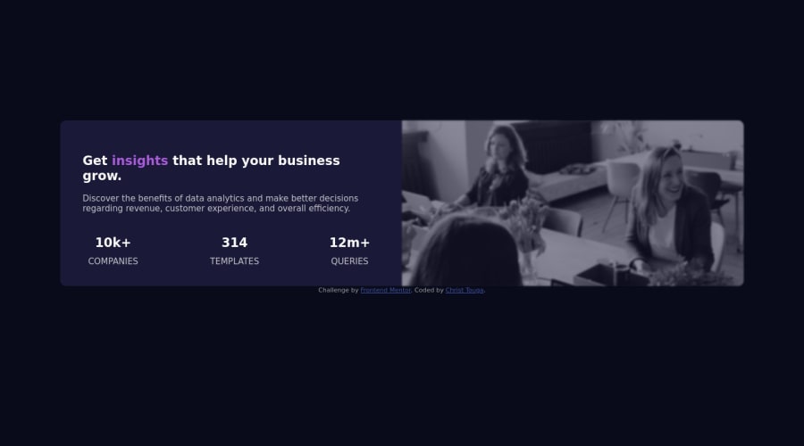
stats-preview-cards using Flexbox and other CSS custom properties


Design comparison

Solution retrospective
I have some questions about my challenge. I recognize that I still need to make progress in responsive design and responsive images using CSS and I have some questions concerning these topics. The first one is rather vague and general. Can you please tell me how you have improved your responsive design skills? In fact I'm curious to see how you have progressed in this domain and if you have any tips to share with me in the field of responsive design and responsive images. The second question is about the site I just shared. Indeed I would have liked to have a media-query with "min=540px". But unfortunately it was not possible because when I reduced the window below 750px, the flex on the bottom left of my container did not have enough space. Do you think it's not a problem if my media querie is set to "min=750px" instead of "min=540px" as i did? Or do you think I should consider reducing the font size of this flexbox? Or do you have an alternative solution? Thank you in advance to all the team. Thanks frontendmentor
Translated with www.DeepL.com/Translator (free version)
Community feedback
- @ViyanMdPosted about 3 years ago
Hi there! I am not an expert, but here's what worked well for me:
- Watch some Kevin Powell Youtube videos on responsiveness, layout and css units and media queries.
- Start with something simple. I am talking about literally practicing with one div or img, then combine an img and a div, the add some text. On each step make sure elements behave exactly how you want.
- As soon as you feel comfortable with something really simple, you can go ahead and start newbie challenges here.
- In programming curiosity is the key. You can ask Slack community for css resources and just go article after article. In most cases authors use simple examples to demonstrate what they are doing. After reading an article, try to repeat it by yourself without looking at the author's code.
Marked as helpful1 - @dannyboi07Posted about 3 years ago
Hey Kevin. I'm pretty new to this stuff too. Just a couple of weeks back I was absolutely dumb at layouts and general css. Content from YT creators like Kevin Powell got me going the right track.
I recommend that you try the below link, from freecodecamp and Kevin Powell on Responsive web design. It's the basics. But Kevin explains the reasoning behind why he chooses certain things when he creates the layout, which I think is the best thing to learn from this video.
https://www.youtube.com/watch?v=srvUrASNj0s&t
Marked as helpful0@dieudonneallognonPosted about 3 years ago@dannyboi07 I can't say no more ! These resources are the best I could recommend too. You actually can learn positioning with flebox at https://flexboxfroggy.com
Marked as helpful1


Please log in to post a comment
Log in with GitHub
Join our Discord community
Join thousands of Frontend Mentor community members taking the challenges, sharing resources, helping each other, and chatting about all things front-end!
Join our Discord