


@vanzasetia
Posted
Hi there! 👋
The most important thing is the quality not the quantity. So, I don't think you need to think about the code length of this project.
Here are some suggestions for improvements.
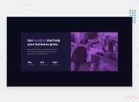
- The image is a decorative image. So, leave the alternative text empty (
alt=""). - Swap the
imgaside with adiv.asideshould be used to wrap any content that is not the main content. - All the page content should live inside the
mainelement. - The statistic numbers are not headings. You can wrap each of them with
spaninstead. - Never use
100vwon thebodyas it doesn't account for scrollbars when present. It may only ever introduce potential overflow/scroll bugs. - Never limit the height of the
bodyelement. It will not allow the users to scroll the page if the page content needs moreheight. You can see the issue by looking at the site on a mobile landscape view. So, my recommendation is to usemin-heightinstead. - I highly recommend writing the styling using the mobile-first approach. It often leads to shorter and better performance code. Also, mobile users won't be required to process all of the desktop styles.
I hope this helps! Happy coding!
Marked as helpful
@abhinavrai10
Posted
@vanzasetia Thank you so much for taking out time and writing such a helpful feedback. I have made some changes based on your recommendations. I hope its better than before. I will surely try "mobile-first" approach from my next projects.
@vanzasetia
Posted
@abhinavrai10
You are welcome! 👍 Happy to know that was helpful! 😊
I wanted to take a look at the updated solution. But, it's giving me a 404 page. Then, I found the correct URL, so I recommend updating the live site URL.
Here is the comparison between the two URLs.
- Current URL - https://abhinavrai10.github.io/stats-preview-card-component-/
- Correct URL - https://abhinavrai10.github.io/stats-preview-card-component/
Great job on improving the site! 👏 Keep it up! 👍

