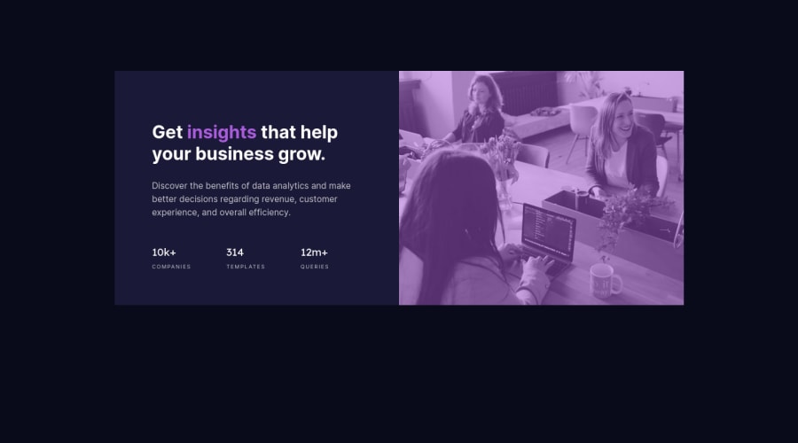
Design comparison
Solution retrospective
This is my second time using the grid. I would really appreciate it if you take the time to answer some of the following question.
- How the usage of BEM could be improved ?
- Would you implement the image in the same way ?
Happy coding.
Community feedback
- @pikapikamartPosted over 3 years ago
Hey, good work on this one. This challenge is just new right? Looks really good.
In terms of layout, yours is really good both in desktop and in mobile.
A couple of little suggestions
- Adding a corner radius is really good like in the original.
- Adding a padding both in the left and right of the body. Because if you resize the browser, your content is touching the sides of the viewport. So adding that padding will be really good.
Regarding your query.
- Bem. Well, I see that you made the selector specific right. Like
header
header__img
. The thing is that, in the way of BEM. You declare a block, but not for a specific component, you make a block that is to be general. General in way it can be used in other sections of the layout.container
something like that.
Then making element out of the block, but still, not specific for a single component but to be reusable as well in other sections. Then making use of the modifier in terms of changing only the element, denoted by the
--
or-
. Because if we declared a specific selector with using__
on them, that is not BEM. BEM is to create reusable and extensible components that will be used in the long run.But for this kind of challenges, since it is small, I think it is fine for now. But for a bigger site, it will take you time to create those but it will be really good. I am still on my way on creating more extensible BEM components with mix of scss.
- For me I will use the img itself hhahaha I don't know, for fast submission I guess
You did a really good job in this solution. First one that I see^^
2@MojtabaMosaviPosted over 3 years ago@pikamart I deeply appreciate your thorough and thoughtful comments and tips.
0 - @Dev-CaesarPosted over 3 years ago
Your project is looking great. How about you try using the 'mix-blend-mode property' set to multiply for the image, and maybe try matching up the stat-heading font sizes to meet the design specification. 👍
1@MojtabaMosaviPosted over 3 years ago@CaesarNweke Best thing Iove trying out new tricks, thank you.
0
Please log in to post a comment
Log in with GitHubJoin our Discord community
Join thousands of Frontend Mentor community members taking the challenges, sharing resources, helping each other, and chatting about all things front-end!
Join our Discord