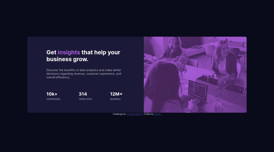
Design comparison
SolutionDesign
Solution retrospective
edited my previous version! any feedback is welcome and thank you for your time
Community feedback
- @vanzasetiaPosted over 2 years ago
Hello, Tenzin! 👋
Congratulations on completing this challenge! 🎉
I notice that the card turns into a two-column layout on
376pxwidth. As you may already know that the card doesn't have enough space to become a two-column layout at376pxwidth. So, I would recommend adjusting the breakpoint for the media query.A few more suggestions.
- For handling the
image-header, I suggest usingpictureelement instead. It will allow you to decide which image should appear based on the user's viewport width. - For the statistic, I would recommend making it one list. If the site has no styling then it would render it as follows. Also, this is how the screenreader would "see" the list.
- 10k+ companies
- 314 templates
- 12m+ queries
- In your CSS, I noticed this selector
.component .proj-prev .tablewhich would much be as.table. I would recommend only nesting when you want to style pseudo-elements, pseudo-classes (:hover,:focus, etc), and@mediaqueries. It's a good practice to keep the CSS specificity as low and flat as possible. High specificity will make your stylesheet hard to maintain.
I hope this helps! 😁
Marked as helpful0@lekdupPosted over 2 years ago@vanzasetia thank you very much Vanza, i will get right on it!
0 - For handling the
Please log in to post a comment
Log in with GitHubJoin our Discord community
Join thousands of Frontend Mentor community members taking the challenges, sharing resources, helping each other, and chatting about all things front-end!
Join our Discord
