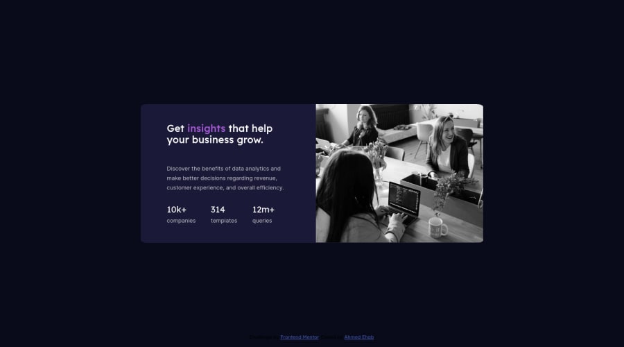
Design comparison
Solution retrospective
All Feedback is welcome , especially on mobile responsiveness work
Community feedback
- @AdrianoEscarabotePosted over 2 years ago
Hi Ahmed Ehab, how are you?
I really liked the result of your project, but I have some tips that I think you will enjoy:
To get closer to the photo overlay effect, you'd better use mix-blend-mode. All you need is the div under the image with this background color: hsl(277, 64%, 61%); eposition mix-blend-mode: multiply and opacity: 80% on the image or apply image to activate the overlay by blending the image with the div's color. See the code below:
img {
    mix-blend mode: multiply;
    opacity: 80%;
}
You can read this content which is explaining these effects with mix-blend-mode: [click here](https://developer .mozilla.org/en-US/docs/Web/CSS/mix-blend-mode)
As you know this project is based only on one page component, so no h1 is needed! because we don't know if this page will have a more important component, but it's always good to prevent accessibility errors so I think it would be good for you to add an
h1in this component, besides being a good practice for when you are developing larger sites, don't worry forget abouth1.The rest is great!
I hope it helps... 👍
Marked as helpful1
Please log in to post a comment
Log in with GitHubJoin our Discord community
Join thousands of Frontend Mentor community members taking the challenges, sharing resources, helping each other, and chatting about all things front-end!
Join our Discord
