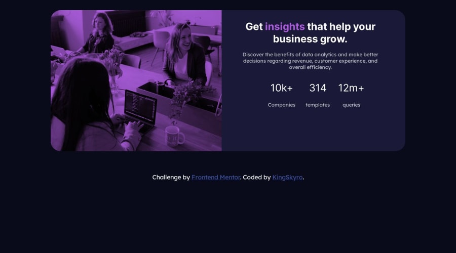
Design comparison
SolutionDesign
Solution retrospective
This project was very challenging 😕 but I am very happy that I am finally done. 😀.
Community feedback
- @AbderrahmaneGuerinikPosted over 1 year ago
Hey👋 it's great you finished this project ! but you can improve your work :
- in desktop devices the image should be in the right side and the text part in the left, for this you can just do the following :
@media (min-width: 1170px) {
main {
       display: flex;
       flex-direction: row-reverse;
    }
}
or change the order of the flex items using order property in css
- you should consider more the margins, spacing, font-weight, text-align specially in desktop devices
I wish this would help you😉, Keep it up ! and enjoy coding
0
Please log in to post a comment
Log in with GitHubJoin our Discord community
Join thousands of Frontend Mentor community members taking the challenges, sharing resources, helping each other, and chatting about all things front-end!
Join our Discord
