Design comparison
SolutionDesign
Solution retrospective
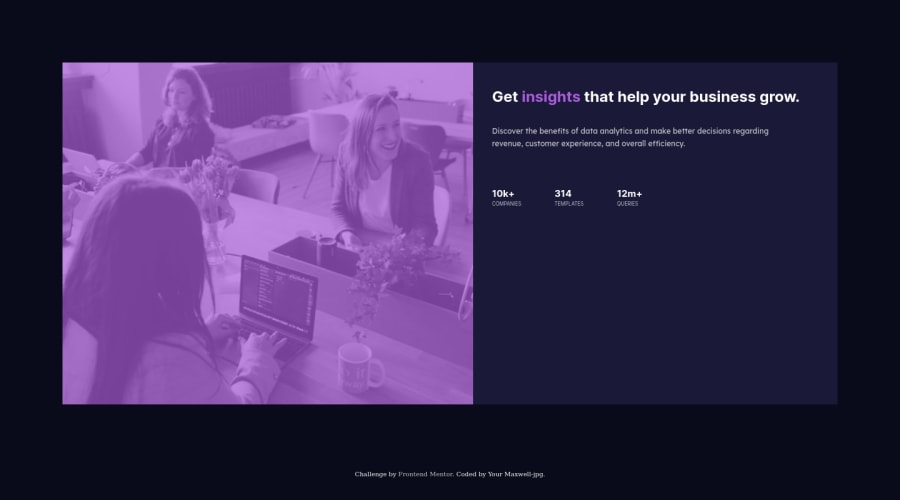
please let me know if i could have done anything differently, i have added picture/ source to the HTML for mobile screens, i have rearranged the text and picture to the correct position for desktop and mobile.
Community feedback
- @SamadeenPosted over 2 years ago
Hey Maxwell!! Cheers 🥂 on completing this challenge.. . Here are my suggestions
- You Should Learn Flexbox it will add you in arranging the content in your container. You can set display to Flex and the Flex direction to row-reverse to switch the image and the headings in the container
- You can also use the max-width property to give your container a certain width and set the max-width of your image to 100% also
- Your container can use border radius to give the little curvy looks at the edges. . Regardless you did amazing and I hope you find this helpful.. Happy coding!!!
0
Please log in to post a comment
Log in with GitHubJoin our Discord community
Join thousands of Frontend Mentor community members taking the challenges, sharing resources, helping each other, and chatting about all things front-end!
Join our Discord