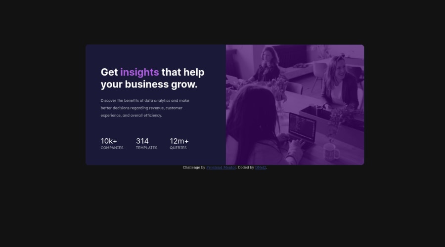
Not Found
Not Found
Not Found
Not Found
Not Found
Not Found
Not Found
Not Found
Not Found
Not Found
Not Found
Not Found
Not Found
Not Found
Not Found
Not Found
Not Found
Not Found
Not Found
Not Found

Submitted

StatsCardWithFlexbox

DNel 200

@TechEdDan2

Desktop design screenshot for the Stats preview card component coding challenge

This is a solution for...

  • HTML
  • CSS
1newbie
View challenge

Design comparison


SolutionDesign

Solution retrospective


I feel like this could be completed in a much more efficient and clean way while still using basic HTML and CSS, so any pointers on best practices would be welcome. Thank you!

Community feedback

@VCarames

Posted

Hey there! 👋 Here are some suggestions to help improve your code:

Best practice, before moving on to the next challenge, always check your FEM report, to see what is incorrect and update your code with it so that you would not make the same mistake over again. This something that should be done right after submitting your challenge.

  • Best practice, before moving on to the next challenge, always check your FEM report, to see what is incorrect and update your code with it so that you would not make the same mistake over again. This something that should be done right after submitting your challenge.
  • The images serve no other purpose than to be decorative; It adds no value. The alt tag should left blank and have an aria-hidden=“true” to hides it from assistive technology.

More Info:📚

https://www.w3.org/WAI/tutorials/images/

  • This challenges requires the use of two images 🎑 for different breakpoints. The picture element will facilitate this.

Here is an example of how it works: EXAMPLE

Syntax:

  <picture>
    <source media="(min-width: )" srcset="">
    <img src="" alt="">
  </picture>

More Info:📚

https://www.w3schools.com/html/html_images_picture.asp

  • Implement a Mobile First approach 📱 > 🖥

With mobile devices being the predominant way that people view websites/content. It is more crucial than ever to ensure that your website/content looks presentable on all mobile devices. To achieve this, you start building your website/content for smaller screen first and then adjust your content for larger screens.

  • For improved accessibility 📈 for your content, it is best practice to use rem for your font-sizeand other property value. While em is best for media-queries. Using these units gives users the ability to scale elements up and down, relative to a set value.

If you have any questions or need further clarification, feel free to reach out to me.

Happy Coding!🎄🎁

0

Please log in to post a comment

Log in with GitHub
Discord logo

Join our Discord community

Join thousands of Frontend Mentor community members taking the challenges, sharing resources, helping each other, and chatting about all things front-end!

Join our Discord