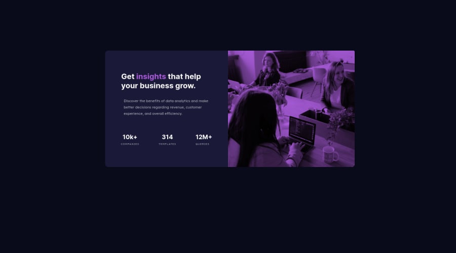
Design comparison
Solution retrospective
I would appreciate feedback. Thanks
Community feedback
- @olesiakissaPosted about 3 years ago
Hey @amakaogujiofor :)
This looks great! I would recommend you to edit padding on your paragraphs from just regular 0.7em to
0.7em 0-> this will fix the paragraph shift that happens on the desktop version and it is meant to save the visual hierarchy of the whole design. And I would also align h2 in your details section with texts below. (text-align: left)I hope this helps!
Marked as helpful0@amakaogujioforPosted about 3 years ago@olesiakissa Many Thanks for the feedback, I'll check them out. Thank you
0 - @brodiewebdtPosted about 3 years ago
I agree, this looks good. Also agree about the alignment. Getting everything aligned and spaced correctly makes a big difference in the overall look of a design. Once you get more builds under your belt, your eye will pick up even small differences.
0
Please log in to post a comment
Log in with GitHubJoin our Discord community
Join thousands of Frontend Mentor community members taking the challenges, sharing resources, helping each other, and chatting about all things front-end!
Join our Discord
