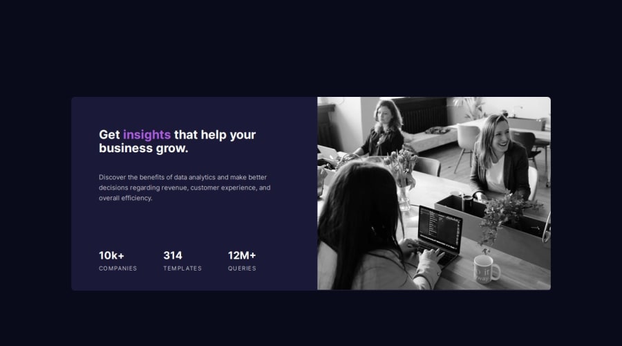


Design comparison

Solution retrospective
This is my first project that i cant figure out the solution.
What challenges did you encounter, and how did you overcome them?I have A Lot of problem facing on this project but i cant fix,these are Problem 1: The Accurate Line Break
Problem 2: The responsive of the image when i resize and middle screen size the image doesn't follow
Problem 3: The Filter effect or The violet in the Image also how to change the img from mobile to desktop
Problem 4: How to select the Company, template and Queries using Pseudo Elements'
If you have any suggestions on how I can improve this project, feel free to leave me a comment!
What specific areas of your project would you like help with?I have A Lot of problem facing on this project but i cant fix,these are Problem 1: The Accurate Line Break
Problem 2: The responsive of the image when i resize and middle screen size the image doesn't follow
Problem 3: The Filter effect or The violet in the Image also how to change the img from mobile to desktop
Problem 4: How to select the Company, template and Queries using Pseudo Elements'
If you have any suggestions on how I can improve this project, feel free to leave me a comment!
Community feedback
- @SanderBuist2Posted 11 months ago
Nice efford. As for your points:
-
make sure you set all your fonts size and weight according to the style-guide
-
I don't really get what you mean here. If you want to not have the empty space underneath your image you can allways set the height to 100% and leave the width on auto. That way your image won't deform. Switch for the mobile version to 100% width and height on auto in this case.
-
By adding "mix-blend-mode: multiply;" to your card__header-img class and setting the backgroundcolor to the right color you will get the result you want. There are other option for the mix-blend-mode, just play with them to see the result.
-
You solved it the same way I did, nothing to add here
1 -

Please log in to post a comment
Log in with GitHub
Join our Discord community
Join thousands of Frontend Mentor community members taking the challenges, sharing resources, helping each other, and chatting about all things front-end!
Join our Discord