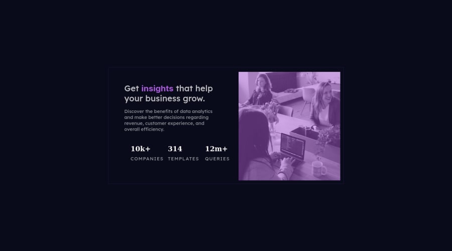
Design comparison
Solution retrospective
Any feedback is appreciated !! - most difficult part would have been spacing within the content. Found it difficult when adding the text with the logo without having the logo squishing or disappearing a good portion of the time. Best practice's and advice appreciated
Community feedback
- @correlucasPosted about 2 years ago
👾Hello @huey-io, congratulations on your solution!
Nice code and nice solution! You did a good job here putting everything together. I’ve some suggestions for you:
1.To get closer to
overlay effect
on the photo as the Figma Design its better you usemix-blend-mode
. All you need is thediv
under theimage
with thisbackground-color: hsl(277, 64%, 61%);
and applymix-blend-mode: multiply
andopacity: 80%
on theimg
orpicture
selector to activate the overlay blending the image with the color of the div. See the code bellow:img { mix-blend-mode: multiply; opacity: 80%; }
Here's a good article explaining these effects with mix-blend-mode:
https://developer.mozilla.org/en-US/docs/Web/CSS/mix-blend-mode
2.A better way to work this solution image, the product image is by using
<picture>
to wrap it on the html instead of using it as<img>
orbackground-image
(with the css). Using<picture>
you wrap both images (desktop and mobile) and have more control over it, since you can set in the html when the images changes setting the screen size for each image.ote that for SEO / search engine reasons isn’t a better practice import this product image with CSS since this will make it harder to the image.Here’s the documentation and the guide to use this tag:
https://www.w3schools.com/tags/tag_picture.asp
3.Think about using relative units as
rem
orem
instead ofpx
to improve your performance by resizing fonts between different screens and devices. Anyhow, if we want a more accessible website, then we should use rem instead of px. REM does not just apply to font size, but to all sizes as well.✌️ I hope this helps you and happy coding!
Marked as helpful0@huey-ioPosted about 2 years ago@correlucas I always look forward to hearing from you mate, I appreciate all the help you give me throughout my projects. SUPER appreciated !!
0 - @AdrianoEscarabotePosted about 2 years ago
Hi Huey.io, how are you?
I really liked the result of your project, but I have some tips that I think you will enjoy:
- Consider using rem for font size .If your web content font sizes are set in absolute units, such as pixels, the user will not be able to re-size the text or control the font size based on their needs. Relative units “stretch” according to the screen size and/or user’s preferred font size, and work on a large range of devices.
i really like the details of your project!
The rest is great!
I hope it helps... 👍
0
Please log in to post a comment
Log in with GitHubJoin our Discord community
Join thousands of Frontend Mentor community members taking the challenges, sharing resources, helping each other, and chatting about all things front-end!
Join our Discord