Design comparison
Solution retrospective
I'm starting on the frontend and any feedback is welcome.
Community feedback
- Account deleted
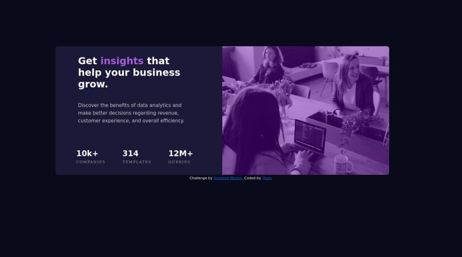
It's look really great. However, the title font should be Inter too, and the stats should within an unordered list, just for the semantic purposes. Also, you can get better results on the image using "mix-blend-mode: multiply" property for that. After that you can turn the opacity down a little bit, something like 80%. Happy code!
1@thaiscodePosted over 3 years ago@MagnonPalhares Thank you very much for the comments, corrections will be applied.
1
Please log in to post a comment
Log in with GitHubJoin our Discord community
Join thousands of Frontend Mentor community members taking the challenges, sharing resources, helping each other, and chatting about all things front-end!
Join our Discord
