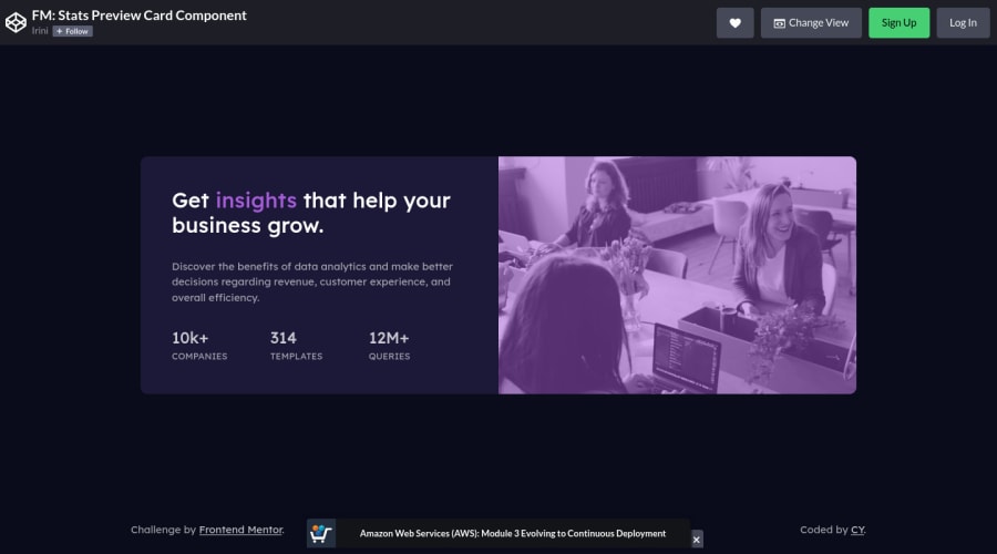
Design comparison
SolutionDesign
Solution retrospective
I've learned about the accessible card component that in the HTML we put images after the title, then use order in CSS to arrange the position.
When I started this project I didn't check the design of the desktop version carefully, so I didn't wrap the text together in the HTML, this made using the grid for the large view impossible.
So I used position: absolute to arrange the image and used padding-right to narrow down the space for text.
This is OK, right?
Community feedback
Please log in to post a comment
Log in with GitHubJoin our Discord community
Join thousands of Frontend Mentor community members taking the challenges, sharing resources, helping each other, and chatting about all things front-end!
Join our Discord
