Design comparison
SolutionDesign
Solution retrospective
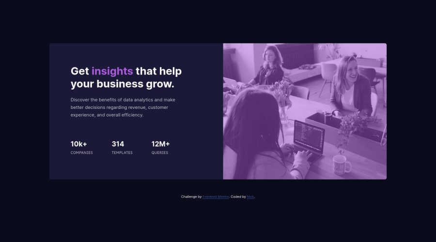
I'm really pleased with this one. I had fun and games with the image again, with getting borders to round and working out how to get the tint on it.
My first time trying media queries as well. I got it all to work nicely in the end, but am not sure it's the cleanest of code.
Any feedback and tips are most welcome.
Thanks,
Community feedback
Please log in to post a comment
Log in with GitHubJoin our Discord community
Join thousands of Frontend Mentor community members taking the challenges, sharing resources, helping each other, and chatting about all things front-end!
Join our Discord
