Not Found
Not Found
Not Found
Not Found
Not Found
Not Found
Not Found
Not Found
Not Found
Not Found
Not Found
Not Found
Not Found
Not Found
Not Found
Not Found
Not Found
Not Found
Not Found
Not Found

Submitted

stats-preview-card-Responsive

@ahmetkabacali

Desktop design screenshot for the Stats preview card component coding challenge

This is a solution for...

  • HTML
  • CSS
1newbie
View challenge

Design comparison


SolutionDesign

Solution retrospective


I would appreciate your suggestions and comments.

Thanks:)

Community feedback

@VCarames

Posted

Hey there! 👋 Here are some suggestions to help improve your code:

  • The article and section elements are being used incorrectly ⚠️ and not needed for this challenge .
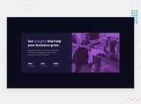
  • The only heading ⚠️ in this component is the “Get insights that help your business grow” everything else will be wrapped in a paragraph element.
  • The statistics at the bottom are a list ⚠️, so it should be built using an unordered List element.

More Info: 📚

MDN <ul>: The Unordered List element

  • The “image” in this component are purely decorative. ⚠️ Their alt tag should be left blank to hide them from assistive technology.

More Info:📚

https://www.w3.org/WAI/tutorials/images/

  • Implement a "Mobile First" approach 📱 > 🖥

Mobile devices are now the dominant 👑 way in which people browse the web, it is critical that your website/content looks perfect 💯 on all mobile devices.

More Info: 📚

Mobile First

  • For improved accessibility 📈 for your content, it is best practice ✅ to use em for media-queries. Using this unit gives users the ability to scale elements up and down, relative to a set value.

If you have any questions or need further clarification, feel free to reach out to me.

Happy Coding! 🎆🎊🪅

Marked as helpful

0
Hassia Issah 50,650

@Hassiai

Posted

Replace <h3> with <p> to fix the accessibility issue.

For the color of the image in the html wrap <picture> in a div tag an give a class for the styling. <div class = " main-image"><picture><img></picture></div> in the css give . main-image a background-color of soft violet and give the img a width of 100% , height of 100%, object-fit: cover, mix-blend-mode: multiply and opacity: 0.8

.main-image{
background-color: hsl();
}
img{
width: 100%;
height: 100%;
object-fit: cover;
mix-blend-mode: multiply;
opacity: 0.8;
}

Hope am helpful.

Well done for completing this challenge. HAPPY CODING

Marked as helpful

0

@ahmetkabacali

Posted

@Hassiai

Hi,

While checking your suggestions I noticed a few errors in the media query, fixed them all.

Ty for feedback.

1

Please log in to post a comment

Log in with GitHub
Discord logo

Join our Discord community

Join thousands of Frontend Mentor community members taking the challenges, sharing resources, helping each other, and chatting about all things front-end!

Join our Discord