Design comparison
Solution retrospective
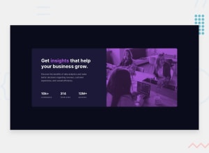
Would like to get some feedback. I can see that my image doesn't look as good as it looks in the design, but that's the only way I could thing of doing to make it purple. Also setting a width to a list of stats on the desktop version seems wrong, but again, this is the only way I could think of to make it appear as it is in the design.
Community feedback
- @grace-snowPosted over 3 years ago
Hi
I'm viewing on mobile and this looks great on portrait but breaks on landscape. If doing a desktop first build as you are here, you want your mobile media query to kick in much earlier maybe 750px or something like that. So whatever screensize where your desktop layout would break, that's where your media query needs to start.
I hope that helps you ☺
1@grace-snowPosted over 3 years agoOther suggestions
- swap the h2s and paragraphs inside your list items for spans. Numbers don't make sense as headings and need to be be in the same meaningful element as the word with them
- always do font sizes in rem/em so text can scale
1@WidePeepoHappyPosted over 3 years ago@grace-snow thank you for feedback. Going to change it today.
0
Please log in to post a comment
Log in with GitHubJoin our Discord community
Join thousands of Frontend Mentor community members taking the challenges, sharing resources, helping each other, and chatting about all things front-end!
Join our Discord
