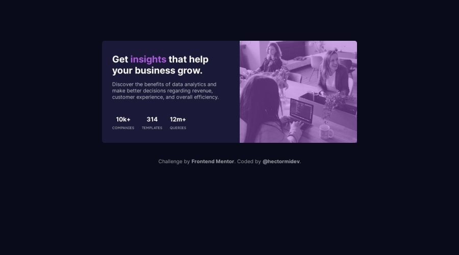
Design comparison
SolutionDesign
Solution retrospective
Frontend Mentor Challenge #6 - Keep learning fellas
Community feedback
- @HassiaiPosted over 1 year ago
Replace <div class="card"> with the main tag and <h2> with <h1> to make the content/page accessible.
For the color of the image, give .card__img-container a background-color of soft violet and give the img a width and height of 100%, object-fit-cover, mix-blend-mode: multiply and opacity: 0.8.
 .card__img-container{
background-color: hsl();
}
img{
width: 100%;
height: 100%;
object-fit: cover;
mix-blend-mode: multiply;
opacity: 0.8;
}
Hope am helpful.
Well done for completing this challenge. HAPPY CODING
0 - @0xabdulkhaliqPosted over 1 year ago
Hello there 👋. Congratulations on successfully completing the challenge! 🎉
- I have other recommendations regarding your code that I believe will be of great interest to you.
CSS 🎨:
- Looks like the component has not been centered properly. So let me explain, How you can easily center the component without using
marginorpadding.
- We don't need to use
marginandpaddingto center the component both horizontally & vertically. Because usingmarginorpaddingwill not dynamical centers our component at all states
- You already using
Flexboxfor layout, but you didn't utilized it's full potential. Just add the following rules to properly center the component.
body { min-height: 100vh; }- Now remove these styles, after removing you can able to see the changes
@media screen and (min-width: 700px) {
   body {
     margin-top: 8rem;
  }
}
- Now your component has been properly centered
.
I hope you find this helpful 😄 Above all, the solution you submitted is great !
Happy coding!
0
Please log in to post a comment
Log in with GitHubJoin our Discord community
Join thousands of Frontend Mentor community members taking the challenges, sharing resources, helping each other, and chatting about all things front-end!
Join our Discord
