


👾 Ekaterine Mitagvaria 👾• 7,600
@catherineisonline
Posted
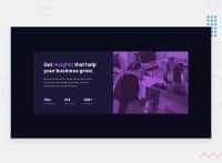
For the image, I did something like this, I hope that helps:
            <div class="image-container">
                <img class="main-image" src="images/image-header-mobile.jpg" alt="">
            </div>
.image-container {
  display: inherit;
  position: relative;
  width: 100%;
  border-radius: 0 10px 10px 0;
  background-color: hsl(277, 64%, 61%);
}
.main-image {
  width: 100%;
  height: 100%;
  position: relative;
  background-size: cover;
  border-radius: 0 10px 10px 0;
  mix-blend-mode: multiply;
  opacity: 0.75;
}
Marked as helpful
0
EDOARDO PITACCIO• 180
@EdoPito
Posted
@catherineisonline It is helpful, I think I need to imrpove and implement my use of position and other values of display as I only use flex for it.
I never use position in my work, apart from creating fixed nav bar for example.
mix-blend-mode: multiply; this, I have no idea what it does lol.
I will look up at documentation for the 3 !! Thank you!
0
