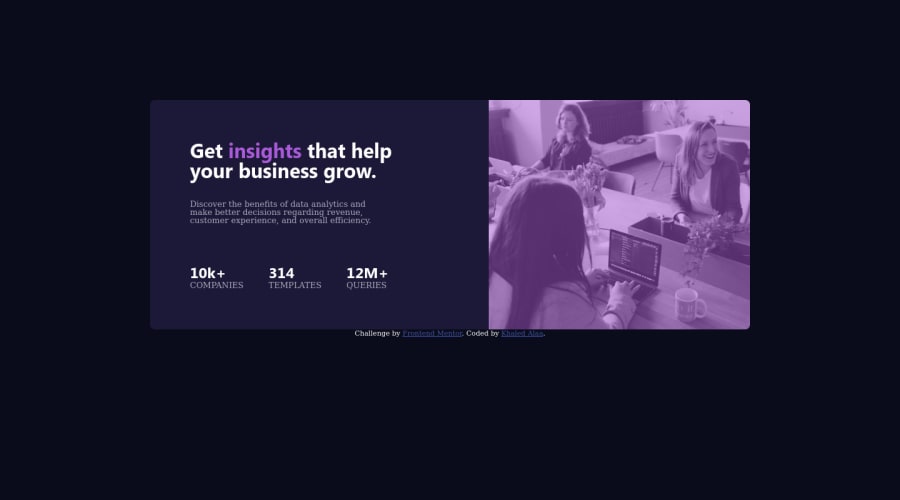
stats preview card component using HTML, CSS, media query and flexbox
Design comparison
Solution retrospective
I will be very happy if you leave me any feedback :)
Community feedback
- @Anubliss-0Posted about 3 years ago
Hi Khaled,
You've done a great job making the page responsive! I was able to resize the page in my browser and still see the important information.
If I were to offer any advice I would focus on the main text in the card-container__paragraph container. You could try to link the font using google fonts. Here is a video showing how to link a web font to your page. https://techstacker.com/how-to-add-google-fonts-to-your-website/
Also, you could consider changing the size of your font in the media query! It could make the text easier to see and read when the page is resized.
0
Please log in to post a comment
Log in with GitHubJoin our Discord community
Join thousands of Frontend Mentor community members taking the challenges, sharing resources, helping each other, and chatting about all things front-end!
Join our Discord
