Submitted almost 3 years ago
Stats Preview Card Component using HTML and CSS
@Shikhar0411
Design comparison
SolutionDesign
Solution retrospective
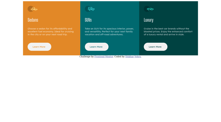
Hi, this is my solution to the Stats preview challenge. This was the first challenge where I had to learn Image and Color overlaying, and I have doubts regarding the same- 1 - Is the method that I have used for image and color overlaying the right one, or does a better method exist? 2 - How to make sure contents of a flex are of the same size? 3 - How should I reduce the large number of media queries I have used? Answers to these, with even links to vids or blogs explaining things from the first principle would be highly appreciated. Thanks
Community feedback
Please log in to post a comment
Log in with GitHubJoin our Discord community
Join thousands of Frontend Mentor community members taking the challenges, sharing resources, helping each other, and chatting about all things front-end!
Join our Discord
