Design comparison
SolutionDesign
Solution retrospective
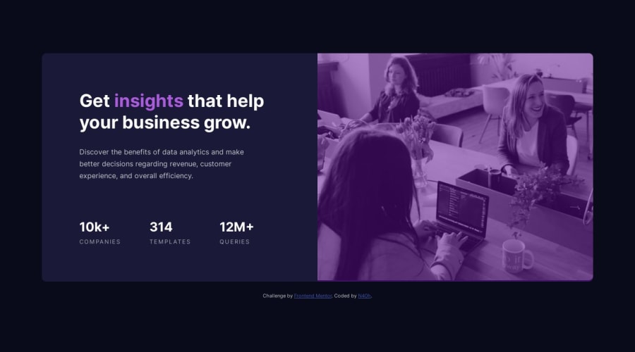
My questions are mostly about the setup of the image.
NOTE: I didn't use any figma files, i've only use the given assets.
- First question is about the color of the layer we apply on the image, how to found the good color to fit the desired design?
- I see that something on the bottom of the image with the layer is wrong but I didn't manage to figure it out, so any feedback for this is really appreciated.
- What is the most appropriate solution about the image to fit the desired design, i could reproduce it but i'm not really satisfied about this, so I would love hear any recommendations / advice for it.
Community feedback
Please log in to post a comment
Log in with GitHubJoin our Discord community
Join thousands of Frontend Mentor community members taking the challenges, sharing resources, helping each other, and chatting about all things front-end!
Join our Discord
