Design comparison
Solution retrospective
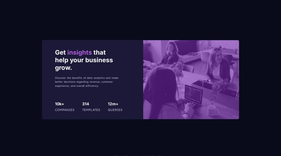
I started by creating all the HTML elements and assigning them classes. I moved onto the CSS, and started by importing fonts, and adding a background color for the entire webpage. Next, I started to design the card, and spent some time trying to get the small details right (such as padding, margins, font sizes etc). I then moved to styling elements like text, images, and finally the filter for the image Furthermore, I spent some time learning about adding filters to images, and how to get the right color for the filter. I used this knowledge and applied it to the design I was looking to achieve. Overall, this project allowed me to learn some new things, and further improve my vanilla CSS skills. Once I finished, I tested the website on multiple broswers, and used the built in device size emulation feature to view what the website would look like on different devices.
Community feedback
Please log in to post a comment
Log in with GitHubJoin our Discord community
Join thousands of Frontend Mentor community members taking the challenges, sharing resources, helping each other, and chatting about all things front-end!
Join our Discord
