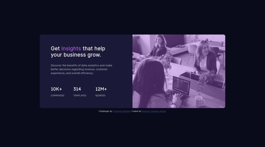
Design comparison
Solution retrospective
Any feedbacks will be accepted.
Community feedback
- @correlucasPosted about 2 years ago
👾Hello , congratulations on your solution!
Nice code and nice solution! You did a good job here putting everything together. I’ve some suggestions for you:
1.To get closer to
overlay effecton the photo as the Figma Design its better you usemix-blend-mode. All you need is thedivunder theimagewith thisbackground-color: hsl(277, 64%, 61%);and applymix-blend-mode: multiplyandopacity: 80%on theimgorpictureselector to activate the overlay blending the image with the color of the div. See the code bellow:img { mix-blend-mode: multiply; opacity: 80%; }2.Use a CSS reset to avoid all the problems you can have with the default CSS setup, removing all margins, and making the images easier to work, see the article below where you can copy and paste this CSS code cheatsheet: https://piccalil.li/blog/a-modern-css-reset/
3.Use a CSS reset to avoid all the problems you can have with the default CSS setup, removing all margins, and making the images easier to work, see the article below where you can copy and paste this CSS code cheatsheet: https://piccalil.li/blog/a-modern-css-reset/
Here's a good article explaining these effects with mix-blend-mode:
https://developer.mozilla.org/en-US/docs/Web/CSS/mix-blend-mode✌️ I hope this helps you and happy coding!
Marked as helpful0@chanduKunchePosted about 2 years ago@correlucas Thank you for the tips. They will help me improve my code.
0 - @VCaramesPosted about 2 years ago
Hey @chanduKunche, some suggestions to improve you code:
-
The statistics section is a list of statistics, so it should be built using an Unordered List along with a List Items Element.
-
This challenges requires the use of two images 🎑 for different breakpoints. The Picture Element will facilitate this.
Here is an example of how it works: EXAMPLE
Syntax:
  <picture>
    <source media="(min-width: )" srcset="">
    <img src="" alt="">
  </picture>
More Info:
https://www.w3schools.com/html/html_images_picture.asp
https://web.dev/learn/design/picture-element/
- To get the image to look like the FEM example, you are going to want to use the Mix-Blend-Mode along with the Multiply Value and include a Opacity with the value of 0.8. (Courtesy of @correlucas)
Code:
img { opacity: 0.8; mix-blend-mode: multiply; }- As the screen shrinks your content begins to overflow. This needs to be fixed.
Happy Coding! 👻🎃
Marked as helpful0@chanduKunchePosted about 2 years ago@vcarames Thank you very much for the tips. I get to know new things. I will try to improve my code.
0 -
Please log in to post a comment
Log in with GitHubJoin our Discord community
Join thousands of Frontend Mentor community members taking the challenges, sharing resources, helping each other, and chatting about all things front-end!
Join our Discord
