Design comparison
Solution retrospective
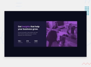
I have struggle when I change color for the picture, i can't make it like the design, if you have any feedbacks or contributions, you can comment, welcome!
Community feedback
- @XenoMeePosted about 1 year ago
Hello! 👋
Your solution looks great and matches the design. Great job! 👏
I might have a few suggestions for you to improve it:
- You can add the website's image as part of the markup instead of using it as background image since it can provide context for people who use screen readers.
- You can use the
::afterpseudo-element for the purple effect on the image instead of an empty div. It is a good practice to not have empty divs in our websites. - Try to build the website using the Mobile First approach since nowadays websites need to also work for small screen devices.
- For your card, you can set a
max-widthinstead of a normal width. That way, you allow it to shrink for small devices and cannot grow more than the max-width value you set. - You can use
gridfor the desktop layout since grid is often used for layout purposes whileflexboxis used more for individual components. - For the Stats section, you can use an unordered list with 3 list items having 2 paragraphs inside. That way your markup is more semantic.
- Try to avoid nesting and use only inline elements inside headings.
- To make the picture color look like the design, you can use the
mix-blend-modeproperty with a value ofmultiply.
Hope this information helped you! 😊
Happy coding!
0@DungnopePosted about 1 year ago@XenoMee Thanks you very much, I just had a change in stats section, it is really work! 😁
0
Please log in to post a comment
Log in with GitHubJoin our Discord community
Join thousands of Frontend Mentor community members taking the challenges, sharing resources, helping each other, and chatting about all things front-end!
Join our Discord
