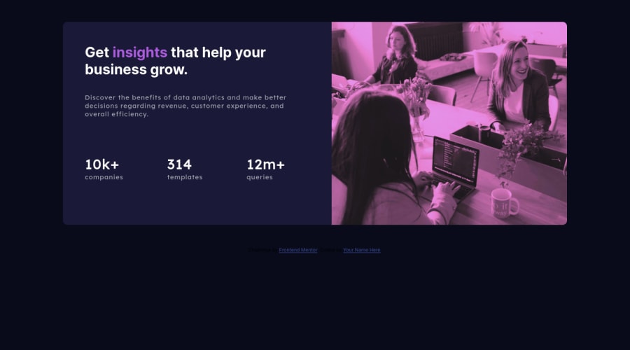
Stats preview card component main 4 challenge finish, html & css :D :D
Design comparison
Solution retrospective
Good day! I finish my fourth challenge! :) :D
I await constructive criticism to improve :D
thanks for reading and your time :D
Community feedback
- @NaveenGumastePosted over 2 years ago
Hello Cristian ! Congo 👏 on completing this challenge
Let's look at some of your issues, shall we:
- Here you used wrong
font-style
 <div class="stats">
          <p><span>10k+</span> companies</p>
          <p><span>314</span> templates</p>
          <p><span>12m+</span> queries</p>
        </div>
happy Coding😀
1@cristiandjrPosted over 2 years ago@Crazimonk It's true, brother, I got confused, I hadn't thought about it that way and I solved it with the first thing that came to my mind hahaha, thanks! :D
1 - Here you used wrong
- @shashreesamuelPosted over 2 years ago
Hey cshjdr good job completing this challenge. Keep up the good work.
Your solution looks good however I think the card needs to be centered in the page in addition the overlay on the image is bit purplish.
I suggest the following
-
Apply some margin on the top using the
margin-topproperty to get it in the exact center. -
use the
mix-blend-modeto achieve the light purple overlay on the image.
In terms of your accessibility issues just change
<div class=`attribution`>to<footer class=`attribution`>.I hope this helps.
Cheers, Happy coding 👍
1@cristiandjrPosted over 2 years ago@TheCoderGuru Wooow bro I didn't know "mix-blend-mode" I'm going to investigate this property!!! :D
I'm going to improve the top and centering!
Good tip the footer I forgot to change it
thank you very much brother :D
1 -
Please log in to post a comment
Log in with GitHubJoin our Discord community
Join thousands of Frontend Mentor community members taking the challenges, sharing resources, helping each other, and chatting about all things front-end!
Join our Discord
