Design comparison
Solution retrospective
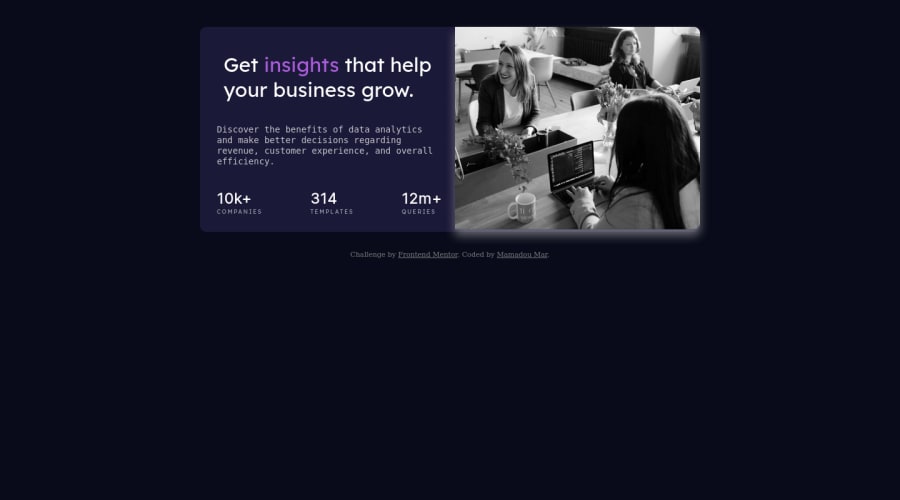
here the stats preview card component, hope you enjoy it, feel free to feedback and comment :)
Community feedback
- @NitaLewskaPosted over 2 years ago
If it's okay, I'd recommend you to try using PixelPerfect browser addon so to make your projects closer to the design, as, when we don't have a Figma or Photoshop prototype, it's hard to check if everything is as in the given pictures =)
Also, you haven't done that purple tint, and that's quite a challenge to implement it with CSS =)
Marked as helpful0@Mar1362Posted over 2 years ago@NitaLewska I'll install PixelPerfect add-on i think it will be easier because since the beginning i'm always guessing the dimensions 😂 thank you a lot for your advice it starts making my day easier. And for the tint i had blue screen filter activated on my machine so i didn't pay attention but I'll go for it, thank you for your help!
1 - @eCuevasCeballosPosted over 2 years ago
It was a very nice try.
Next time you can use classes in every html label, for example:
<h1 class="Name of the class">Content</h1> This is a good practice for development, you can check more about this in: https://www.w3schools.com/html/html_classes.aspAlso, it is easier to build this type of components by using a combination of flexbox and CSS Grid, it would help you to build layouts a lot faster. https://developer.mozilla.org/es/docs/Web/CSS/CSS_Grid_Layout
Happy Coding!
Marked as helpful0@Mar1362Posted over 2 years agoHi @eCuevasCeballos thank you for your feedback. I consider your advices but i challenged my self to make the layout without flexbox or grid just for fun 😃. I'll use now those two property to manage my layout since I finished that challenge. Thank you!
0
Please log in to post a comment
Log in with GitHubJoin our Discord community
Join thousands of Frontend Mentor community members taking the challenges, sharing resources, helping each other, and chatting about all things front-end!
Join our Discord
