Design comparison
Solution retrospective
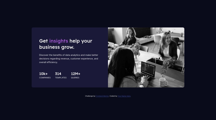
Hello guys. This is my six solution to this challenge. Still as a form of training, I started the project with Mobile First, and adjusted it with media query.please give me feedback and any suggestion, advance welcome for feedback
Community feedback
- @correlucasPosted about 2 years ago
👾Hello Faruk Ahmad, congratulations for your new solution!
1.You need to fix the
container sizethat is a bit off, this challenge uses the standard container size that ismax-width: 1110px.2.To make the image have a better fit inside of it, make the component image responsive with
display: blockandmax-width: 100%(this makes the image fit the column/div size) and respect the component size while it scales down. To make it crop while scaling useobject-fit: cover.img { display: block; object-fit: cover; max-width: 100%; }3.Make your image purple with the same overlay effect, you need to use
mix-blend-modeto make this color blend between the image and the background-color of the container. See the steps below to apply to theimgorpictureselector:img { mix-blend-mode: multiply; opacity: 75%;}✌️ I hope this helps you and happy coding!
0 - @hyrongennikePosted about 2 years ago
HI
NIce job on the challenge
I see you have an overlay div but you're not using it you can add the below code to add the overlay:
.overly {
    background: hsl(277, 64%, 60%);
    width: 100%;
    height: 100%;
    mix-blend-mode: multiply;
}
On mobile maybe just decrease the height of the .container .picture div that way more of the image will be visible.
0
Please log in to post a comment
Log in with GitHubJoin our Discord community
Join thousands of Frontend Mentor community members taking the challenges, sharing resources, helping each other, and chatting about all things front-end!
Join our Discord
