Design comparison
SolutionDesign
Solution retrospective
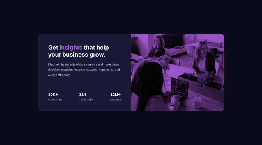
Hi there, I’m Raha and this is my solution for this challenge. 👋
Any feedback on how I can improve and reduce unnecessary code is welcome!
Thank you. :)
Community feedback
- @sircarloschavesPosted over 1 year ago
I don't know if it's just me, but I feel like the
letter-spacingof the words 'templates, queries and companies' in the original design is a little larger, otherwise it's perfect.1
Please log in to post a comment
Log in with GitHubJoin our Discord community
Join thousands of Frontend Mentor community members taking the challenges, sharing resources, helping each other, and chatting about all things front-end!
Join our Discord
