Design comparison
Community feedback
- @KrzysztofRozbickiPosted almost 2 years ago
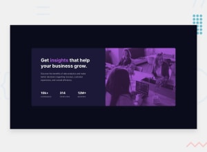
This is quite tricky one - i spent too much time looking into that - but once you think about it in reverse and do some research it seems very easy you just have to do 3 things:
In the container you put the
background-color:var(--text-accent-500);or something like that - the color is EXACTLY same as accent color on insight word.Then you put image ON that background - but with
opacity: 0.75;
and NECESSARY withmix-blend-mode: multiply;and suddenly magic happens.It was very good lesson for me and I hope it will help you with next similar projects - especially you can google mix-blend-mode and have fun with it (I wasn`t aware that it exists before).
Marked as helpful0@forjoaPosted almost 2 years ago@KrzysztofRozbicki i haven't though about this solution if you don't tell me. You are right! It works better and it is also super easy to understand. Thank you so much.
0 - @nelsonuprety1Posted almost 2 years ago
Hello Joaquin, I used
background: linear-gradient(hsl(277, 64%, 61%, 0.5), hsl(277, 64%, 61%, 0.5)), url('/images/image-header-mobile.jpg');to achieve the desired purple filter . I used linear gradient with the color that has been provided in the style guide file.
Marked as helpful0
Please log in to post a comment
Log in with GitHubJoin our Discord community
Join thousands of Frontend Mentor community members taking the challenges, sharing resources, helping each other, and chatting about all things front-end!
Join our Discord
