


Raymart Pamplona• 16,120
@pikapikamart
Posted
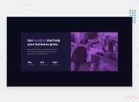
Hey, great work on this one. Layout in desktop is good as well as the mobile. The responsiveness I think is great in here, though for like at point 1000px, you will notice that the background-image is not taking the whole height, setting background-size: cover will fix it.
Some other suggestions would be:
- For this one, it would be great if the layout is centered both horizontally and vertically. It would be great if your
bodytag has these css:
align-items: center;
display: flex;
flex-direction: column; # this is because there is a footer that is sibling by main
justify-content: center;
margin: 0; # removes default margin
min-height: 100vh; # takes full viewport's height
- For those list of information, the "companies" , "templates" aren't really suited to be a heading tag, if you were to use heading tag, it would be great to make a single heading tag, an
sr-onlytag, the structure would look like:
<section>  # section for the list of informations
  <h2 class="sr-only"> company website informations </h2>
  < ul /> # your list of information are in here
</section>
This way, user would know that this section have the list of information about the company.
Other than those, the site looks good :>
Marked as helpful
1
Quỳnh Giao• 80
@giaonnq1401
Posted
@pikamart Thank you for reviewing my code, very detailed and insightful. Wish you have a nice day!!!
0
