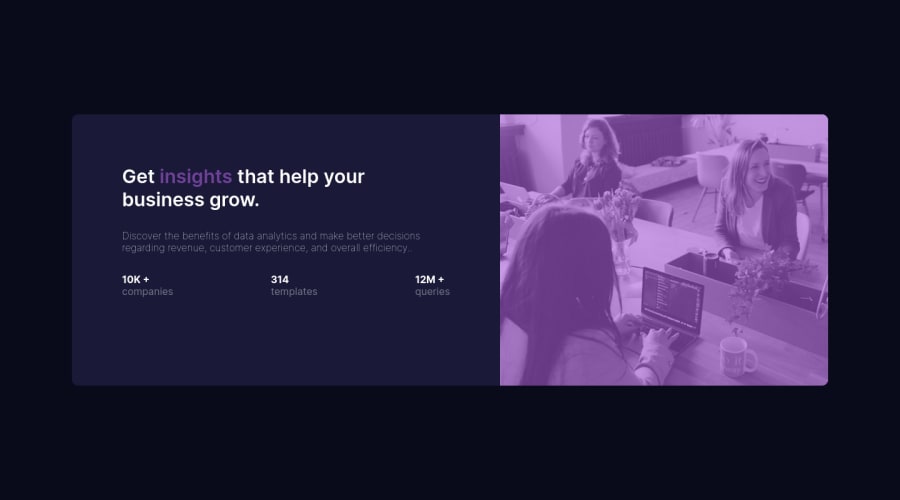
Design comparison
Solution retrospective
little bit , when doing resposive .
Community feedback
- @correlucasPosted over 2 years ago
👾Hello Zakaria, congratulations for your first solution and 😎 welcome to the Frontend Mentor Coding Community!
Your solution is just great and really responsive. I have some tips for your:
1.Use the file from starter files given by FEM called
style-guide.mdto have the exact hsl code for the colors and font-sizes used in this challenge.2.To avoid your image stretching and losing its proportions use
img {display: block; max-width: 100%;}3.To add the exact same purple overlay effect for the image, matching the design files you can user,
filter,background-blend-modeormix-blend-mode(the best choice in my opinion). See the code belowimg { mix-blend-mode: multiply; opacity: 0.8;}👋 I hope this helps you and happy coding!
1 - @MahdiSohailyPosted over 2 years ago
Hello dear, you have done a great job, but it looks like your solution image is not looking the exact same as the challenge. for this, you need to give a pink background to the container of the image and apply the following style to your image.
mix-blend-mode: multiply;
  opacity: 0.8;
if it was helpful, mark my comment as helpful.
0
Please log in to post a comment
Log in with GitHubJoin our Discord community
Join thousands of Frontend Mentor community members taking the challenges, sharing resources, helping each other, and chatting about all things front-end!
Join our Discord
