Design comparison
Solution retrospective
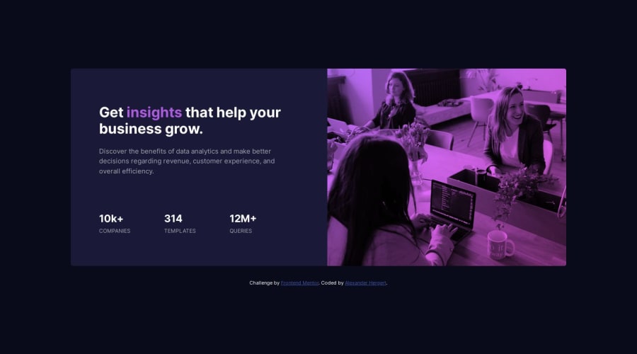
I had a hard time to find the right way to let the image look like it should. I can't match the dark tones. If you have an advice for me feel free to help out :D Ofcourse any feedback is welcome.
Community feedback
- @imadvvPosted almost 2 years ago
Greetings Alexander Hergert! Congratulations on completing this challenge! 👏👏👏
You did a great job on this task! I have a suggestion that might make it even better. Have you considered using
mix-blend-mode? It's a CSS property that can enhance your design. You can learn more about it on the Mozilla Developer Network website: https://developer.mozilla.org/en-US/docs/Web/CSS/mix-blend-mode.Additionally, instead of using a solid background color, you can experiment with gradients. Here's an example of how you could implement it:
.section-image::before {
/* background-color: var(--soft-violet) */
background: linear-gradient(320deg, #ff61f3 0, #b86ffb 100%);
}

.section-image img {
mix-blend-mode: multiply;
}
Feel free to play around with the values and see what works best for you!
Overall, your attempt was really good. Keep up the great work!
Marked as helpful1@alexander-hergertPosted almost 2 years agoThank you imad for your response. I have read about that but failed in using it :) But with your snippet it seems that I finally get it :) Thank you very much.
1@imadvvPosted almost 2 years agoYou're welcome! I'm glad to hear that my response was helpful to you. Programming can be challenging, but with practice and guidance, it becomes easier to understand and use different concepts. If you have any more questions or need further assistance, feel free to ask. Happy coding!
1
Please log in to post a comment
Log in with GitHubJoin our Discord community
Join thousands of Frontend Mentor community members taking the challenges, sharing resources, helping each other, and chatting about all things front-end!
Join our Discord
