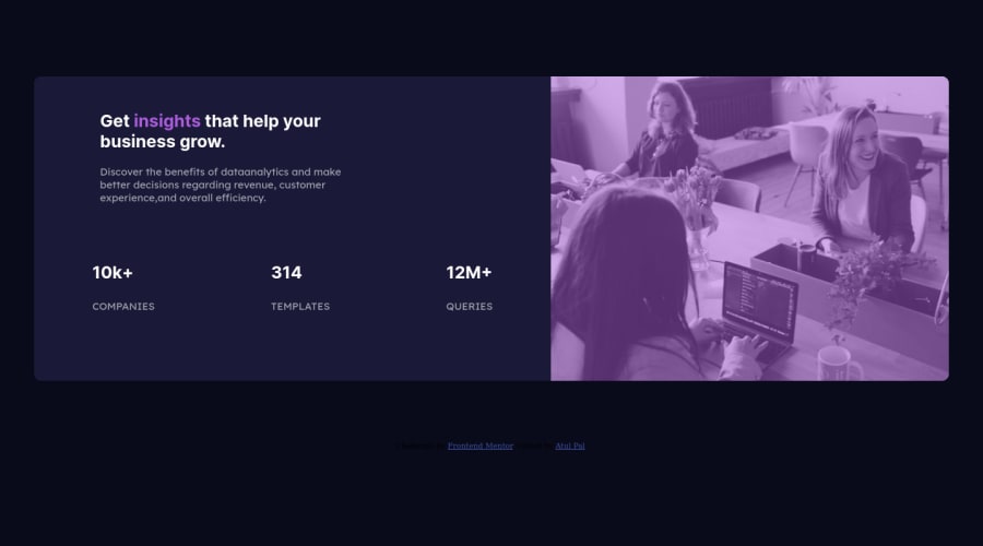
Design comparison
Solution retrospective
It is my second challenge i hope you all give suggestions to this challenge because your suggestions will definitely help me a lot and i made this as closer as much according to the design.
Community feedback
- @akash-1712Posted over 3 years ago
I have a suggestion for you to align container to center of screen: 1)body{ height:100vh,display:flex,align-items:center,justify-content:center} it automatically place the div.container in center of screen. 2)For Mobile layout just give {height:initial} in body and add margin-top:10px to div.container. it helps to make your design more responsive.
Use flex-direction:row in div.container and use order:1 and 2 for div.card and Image respectively to align side by side for Destop layout.
Use flex-direction:column in div.container and use order:2 and 2 for div.card and Image respectively to align up and down for mobile layout.
Marked as helpful0@apple14-heroPosted over 3 years ago@akash-1712 thank you for your valuable time and i am totally understand what you are suggests me . I'll definitely do this thanks again 🙂
0
Please log in to post a comment
Log in with GitHubJoin our Discord community
Join thousands of Frontend Mentor community members taking the challenges, sharing resources, helping each other, and chatting about all things front-end!
Join our Discord
