


@AgataLiberska
Posted
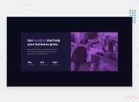
Hi @Josh-Ay! Well done on this challenge! The one issue I noticed is that the image doesn't quite fill out the container (you can see what I mean above in the design comparison). You can fix that easily by setting background-position to cover. I would also add a max-width to the card in addition to the width in %, on large screens it will get very long and the image won't look good.
Also, an easy way to center an item in the viewport is to set container to display: grid; place-items: center; (you can also use flexbox to do that)
Hope this helps :)
@Josh-Ay
Posted
Hello @AgataLiberska! Thank you so much for the feedback! I really appreciate you taking out time to view my attempt. Ohh yes yes, I see what you mean, thank you. I would make those changes.
I checked out your profile and was dumbfounded at how awesome and detail-oriented your solutions are!! If you have the time, I was hoping you could give me some tips
@AgataLiberska
Posted
@Josh-Ay Thank you! Sure if I can, do you have any questions in particular or are you looking for general tips?
@Josh-Ay
Posted
@AgataLiberska If I'm being completely honest, I was hoping you could maybe be my mentor?
@AgataLiberska
Posted
@Josh-Ay oh sorry, definitely not confident enough to be a mentor, I'm only learning myself!
@Josh-Ay
Posted
Sure, I understand. Thank you so much for your feedback on my solution!
