


@etiennedesfontaines
Posted
Hi Abhinav,
Your solution looks great on mobile, and I really like your use of mix-blend-mode for your colour overlay. Well done.
On desktop, I think it's mostly the sizing and positioning of your elements that might benefit from a second iteration.
I would suggest giving your <body> tag a height of 100vh. This will force it to take up the entire screen. Then, if you create a new <div class="card-main> within your body element, that wraps all other content, it will allow you to more easily position the card with similar spacing to what you see in the desktop design file. You can achieve this quite simply by adding "display:flex;" to your body element (as I notice you have done) but then including "justify-content: centre;" and align-items: centre". Your card component should now be sitting directly in the middle of your screen.
Increasing the "padding-right" of your h1, main, and footer elements will help with the copy spacing. Just adjust it whilst taking note of the copy's rag and you will know when it is correct.
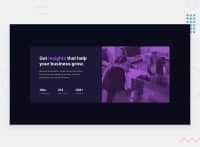
Looking at you image, I see you have kept the aspect ratio, which is great. But it is being cropped. Increasing the padding of the elements I suggested above should help with this as you copy will need more height, which will expand your div and reveal more of your image. If the padding alone doesn't do it, just play around with the sizing of your containers to try to allow full image visibility, with correct copy alignment and spacing.
I also think it will be beneficial to consider using semantic html markup. I know this project is more about the styling, but it's always good to develop positive programming habits and using semantic html is one that will really benefit you in the long run. This document was a huge help to me, perhaps it will be valuable to you too: https://developer.mozilla.org/en-US/docs/Web/HTML/Element
I hope you find my feedback useful. Good luck on your next iteration of this project, I look forward to seeing the result.
Marked as helpful
@abno-24
Posted
@etiennedesfontaines Thank you soo much for your feedback and your suggestion that how should I handle such things I really loved that finally I'm getting guidance from somewhere. I'll definitely keep this in my mind.
Thank you so much for valuable time and help which you have given to me.
@etiennedesfontaines
Posted
@abno-24 It's a pleasure. Here is a great resource that will teach you everything you need to know about Flexbox: https://css-tricks.com/snippets/css/a-guide-to-flexbox/
