

Design comparison

Community feedback
- @HassiaiPosted almost 2 years ago
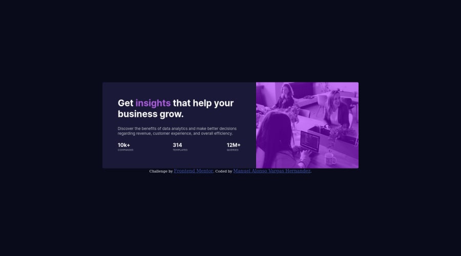
For the color of the image, give .image-header a background-color of soft violet, and the img a width of 100% instead of fixed max-width value, object-fit: cover, mix-blend-mode: multiply and opacity: 0.8.
.image-header{
background-color: hsl();
}
img{
width: 100%;
height: 100%;
object-fit: cover;
mix-blend-mode: multiply;
opacity: 0.8;
}
the no need to style . contain and redeclare display: grid and its properties to center .card.
In the desktop design , give .image-header a width of 50% and .info a width of 50%. In the media query, increase the width of card, for a responsive content replace the width in .card with max-width .
.card{max-width: 25rem;}25rem is 400px.Hope am helpful.
Well done for completing this challenge. HAPPY CODING
Marked as helpful0

Please log in to post a comment
Log in with GitHub
Join our Discord community
Join thousands of Frontend Mentor community members taking the challenges, sharing resources, helping each other, and chatting about all things front-end!
Join our Discord