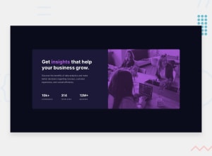
Design comparison
SolutionDesign
Solution retrospective
Any feedbacks from you awesome developers are most welcome. I want to improve my code as far as I can. thanks in advance.
Community feedback
- @darryncodesPosted almost 3 years ago
Hi Ragab,
Good effort, well done!
- it might be cool to try adding a solid
linear-gradientto a background image:background-image: linear-gradient(hsl(277, 64%, 61%), hsl(277, 64%, 61%) ), url(../your/image-filepath);this will help achieve the purple colour to match the design, rather than the overlay approach - you also need to explore
background-blend-mode. (multiplyusually does the trick) - it's best practice to not set fixed heights, it plays havoc with responsive design. you should let the content set the height. Also use max-widths over widths to help with responsiveness too
- your design breaks at tablet size, it might be worth bringing in your media query sooner
- you could consider using flexbox to center the design nicely in the viewport. I'd suggest the following (also add a max-width to your
.cardclass):
    /* padding: 11rem; */ REMOVE
    /* max-width: 1308px; */ REMOVE
    min-height: 100vh; UPDATE
    font-family: var(--font-f1);
    display: flex;
    flex-direction: column;
    justify-content: center;
    align-items: center;
Marked as helpful1@RagaBoGaaPosted almost 3 years ago@darryncodes Hello!, I really appreciate your feedback! thanks for it and definitely I am going to keep it in my mind and try it.
0 - it might be cool to try adding a solid
Please log in to post a comment
Log in with GitHubJoin our Discord community
Join thousands of Frontend Mentor community members taking the challenges, sharing resources, helping each other, and chatting about all things front-end!
Join our Discord
