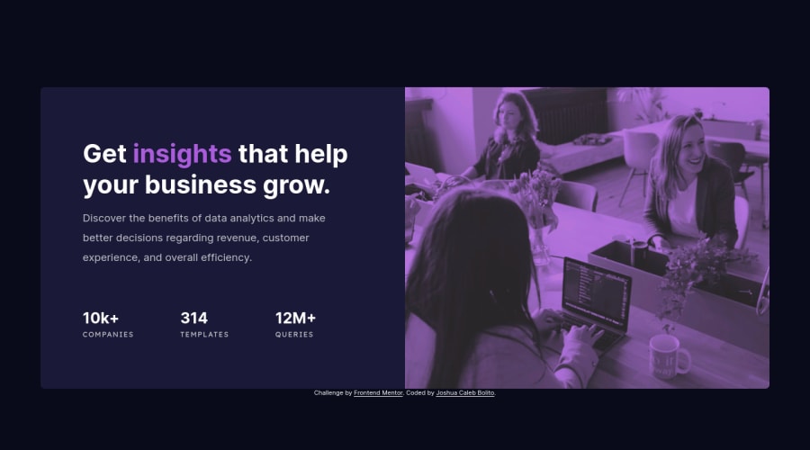
Design comparison
Solution retrospective
- Were the semantic tags used properly?
- Is the component properly responsive to various device sizes?
- What would you recommend in order to improve my code / output?
Your feedback would be highly appreciated!
Community feedback
- @vanzasetiaPosted about 2 years ago
Hi, Joshua Caleb Bolito! π
Here are some suggestions for improvements.
- I would recommend using
picture
element to handle the image. Then, you can addmedia
attribute to control which image should appear based on the condition. - For the statistic, I would suggest swapping the
article
withul
and wrap each list item withli
. Also, the statistic number should not beh2
elements. It should be a list with three bullet points.- 10k+ companies
- 314 templates
- 12m+ queries
- I recommend adding
rel="noopener"
to any anchor tags that havetarget="_blank"
. This is a security essential for external links. I suggest reading the web.dev article to learn more about this.
That's it! I hope you find this useful! π
Marked as helpful1@JCBolitoPosted about 2 years ago@vanzasetia took your advice and edited the code! Thank you for your suggestions! π
0@vanzasetiaPosted about 2 years ago@JCBolito
Great job on using a list element and adding
rel="noopener"
to all links that will open a new tab! πFor the
picture
element, that is not the way of using it. You need to usesource
element. I recommend taking a look at the MDN documentation forpicture
element to learn how to use it.0 - I would recommend using
- @franklynwisdomPosted about 2 years ago
Hi Joshua,
Kudos to you on completing the project, however, from my observation: -You made good use of HTML semantics -The layout looks good on all screen sizes, however, the mobile design is been displayed on a laptop of size 1280px and above, kindly make the proper adjustment on that. -Yes, the code is well structured and readable.
Well done!
Marked as helpful1@JCBolitoPosted about 2 years ago@franklynwisdom took your recommendation and edited the breakpoint of the media query from 1440px to 1000px in hopes to make it more responsive to tablets as well. Thank you for your suggestion! π
0 - @correlucasPosted about 2 years ago
πΎHello Joshua Caleb, Congratulations on completing this challenge!
To make your hero image have the same look and the color purple overlay, you need to use
mix-blend-mode
using themultiply
one.The mix-blend-mode CSS property sites how an element's content should blend with the content of the element's parent and the element's background.Hereβs how you can add this to your
img
selector:img { mix-blend-mode: multiply; opacity: 84%;}
Here's a good article explaining these effects with mix-blend-mode:
https://developer.mozilla.org/en-US/docs/Web/CSS/mix-blend-mode
βοΈ I hope this helps you and happy coding!
0 - @franklynwisdomPosted about 2 years ago
@JCBolito I just confirmed that you have made the necessary adjustments well done!
0
Please log in to post a comment
Log in with GitHubJoin our Discord community
Join thousands of Frontend Mentor community members taking the challenges, sharing resources, helping each other, and chatting about all things front-end!
Join our Discord