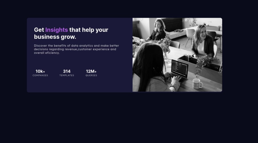
Design comparison
Community feedback
- @finkenmannPosted almost 2 years ago
My first tip to solve many problems in your project: Go mobile first. Create the page for the single-column mobile version first and then add
@media (min-width: xxxpx)for the customizations for the desktop.Give your container a width of e.g. 90vw (viewport width) and margin 5vw (this gives you the same gap on top). This way the container is nicely centered and your content doesn't stick to the edge... and its already responsive, because it grows nicly.
For the mobile layout you don't need flex at all. Just arrange the block elements one below the other and everything fits.
For desktop only a little code for flex elements is needed. One for the main elements and one for the stats list.
My last tip... Make sure that you have a live server running in your working environment, where you can immediately see every change in your code. Use vs code as editor and install the extension live server, if don't use this editor already ;-) . This also helps you to keep track of your work. If you do a lot of work before you look at the result in the browser, debugging is much harder. Use FireFox for development. The responsive preview is better and clearer than Chrome's dev tools (my opinion ;-). I like the responsive preview in FireFox because it shows up without the whole develpment windows, which often use too much room on my screen. But if you need it, you easily can open them. Shortcut is alt ctrl m to open the responsive view.
Marked as helpful0 - @VCaramesPosted almost 2 years ago
Hey there! 👋 Here are some suggestions to help improve your code:
- To properly center your content to your page, you will want to add the following to your
BodyElement (this method uses CSS Grid):
body {
    min-height: 100vh;
    display: grid;
    place-content: center;
}
More Info:📚
[Centering in CSS][https://moderncss.dev/complete-guide-to-centering-in-css/]
- The only heading in this component is the “Get insights that help your business grow” everything else will be wrapped in a
paragraphelement.
- The statistics at the bottom are a list, so it should be built using an
unordered Listelement.
More Info:📚
MDN <ul>: The Unordered List element
- This challenges requires the use of two images 🎑 for different breakpoints. The
pictureelement will facilitate this.
Here is an example of how it works: EXAMPLE
Syntax:
  <picture>
    <source media="(min-width: )" srcset="">
    <img src="" alt="">
  </picture>
More Info:📚
https://www.w3schools.com/html/html_images_picture.asp
- To get the image to look like the FEM example, you are going to want to use the
mix-blend-modealong with themultiplyvalue and include aopacitywith the value of 0.8.
Code:
img {
  opacity: 0.8;
  mix-blend-mode: multiply;
}
If you have any questions or need further clarification, feel free to reach out to me.
Happy Coding!🎄🎁
Marked as helpful0 - To properly center your content to your page, you will want to add the following to your
- @mikej321Posted almost 2 years ago
Hello there and congrats on finishing your project!
Some things that I may suggest to help improve your code.
Change this in the body element
body { min-height: 100vh; display: flex; flex-direction: column; align-items: center; justify-content: center; }
This should center the project within the center of the page. Next, remove the margins from your .section and instead, put those same margins in a padding attribute on the .section. This should place the content where you want without using margins as that will throw the alignment of your project off. Finally, for semantic purposes, the <main> tag should wrap around the <section> tag and contain all of your html except the <footer> tag. This should help with the semantic check.
Hope this helped and Happy Holidays!!
Michael Johnson
Marked as helpful0
Please log in to post a comment
Log in with GitHubJoin our Discord community
Join thousands of Frontend Mentor community members taking the challenges, sharing resources, helping each other, and chatting about all things front-end!
Join our Discord
