Not Found
Not Found
Not Found
Not Found
Not Found
Not Found
Not Found
Not Found
Not Found
Not Found
Not Found
Not Found
Not Found
Not Found
Not Found
Not Found
Not Found
Not Found
Not Found
Not Found

Submitted

Stat Preview Card with HTML and CSS Flexbox

@Cre8steveDev

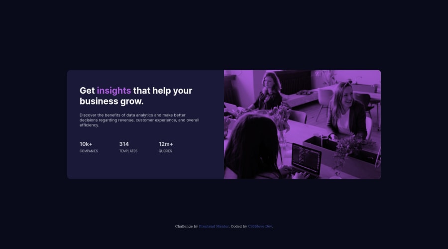
Desktop design screenshot for the Stats preview card component coding challenge

This is a solution for...

  • HTML
  • CSS
1newbie
View challenge

Design comparison


SolutionDesign

Solution retrospective


Hello! Here's my submission for the Stat Preview Card. I'll appreciate your comments on how to improve on areas where my novice eyes are unable to see just yet. Thank you.

Community feedback

@VCarames

Posted

Hey there! 👋 Here are some suggestions to help improve your code:

  • It is best practice ✅ to use, classes for styling purposes, while using ids solely for JavaScript.
  • The only heading ⚠️ in this component is the “Get insights that help your business grow” everything else will be wrapped in a paragraph element.
  • The statistics at the bottom are a list ⚠️, so it should be built using an unordered List element.

More Info: 📚

MDN <ul>: The Unordered List element

  • NEVER ❌ do this as it creates accessibility issues for users and it is outdated.
html {
  font-size: 25px;
}
  • Implement a "Mobile First" approach 📱 > 🖥

Mobile devices are now the dominant 👑 way in which people browse the web, it is critical that your website/content looks perfect on all mobile devices.

More Info: 📚

Mobile First

If you have any questions or need further clarification, feel free to reach out to me.

Happy Coding! 🎆🎊🪅

Marked as helpful

1

@Cre8steveDev

Posted

@vcarames Thank you so much for your feedback. I've taken noted of the points you raised and ill implement them on my next challenge. Thank you for the article link also. I'm most grateful

0
Hassia Issah 50,650

@Hassiai

Posted

Replace<div class="container">with the main tag and <div class="attribution"> with the footer tag to fix the accessibility issues.

Give .container a max-width value instead of a min-width and increase the width value. e.g. .container{ max-width: 1440px; width: 80%; margin: 0 auto; padding: 20px 0;}

Use relative units like rem and em instead an absolute unit (px) as the unit for the width, margins, paddings and font-size values. For more on CSS unit click here

Add opacity: 0.8 to the .imageholder to get the color in the design. In the media query add .ratings, give it a flex-direction of row.

Hope am helpful.

Well done for completing this challenge. HAPPY CODING

Marked as helpful

0

@Cre8steveDev

Posted

@Hassiai Thank you so much for your kind review.

I have made the changes as you advised. Thank you for the article on CSS Units. It was a really nice read. However, I'm not able to implement changing the units this time. I'll keep them in mind on subsequent challenges.

https://github.com/Cr8steveDesign/statpreviewcard/tree/main/stats-preview-card-component-main

0

Please log in to post a comment

Log in with GitHub
Discord logo

Join our Discord community

Join thousands of Frontend Mentor community members taking the challenges, sharing resources, helping each other, and chatting about all things front-end!

Join our Discord