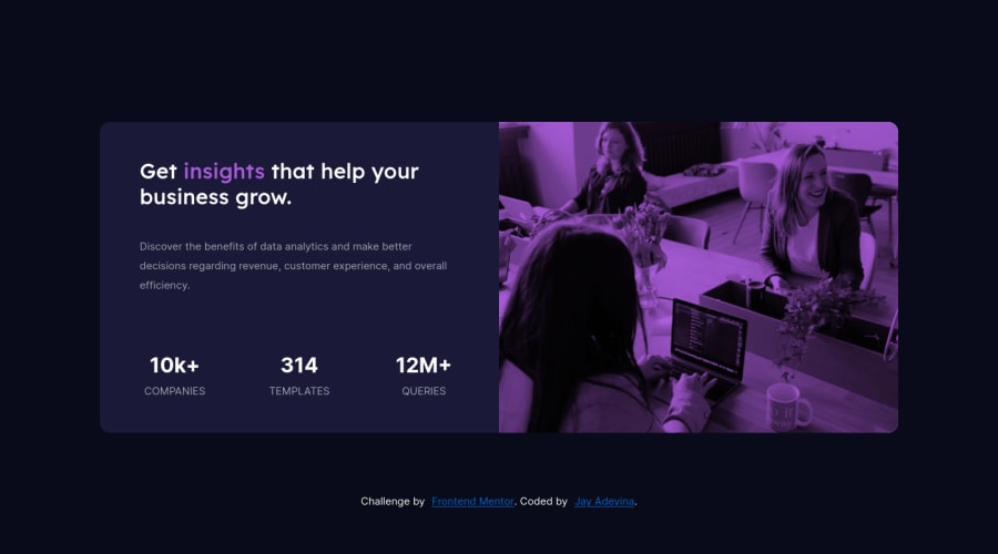
Design comparison
Solution retrospective
Is it possible to guesstimate font sizes and boldness for headings and such from just a jpeg or do we need the pro version? Thanks for taking a look at my project.
Community feedback
- @PhoenixDev22Posted almost 3 years ago
Greeting Jay, Congratulation on completing another frontend mentor project . Your solution looks nice.`
-
There should be two landmark components as children of the body element - a main (which will be the component) and a footer (which will be the attribution). -You're misusing section element, section is for a bigger chunk of content often titled by
<h2>
.Just a main element for the component and a footer for the attributionread more about sections.Instead, make the card a main and use`< div>``s for the two halves inside it -
Numbers don't make sense as
<h2>
s. -
The number and word have to be read together to make sense so need to be in the same meaningful element. so only a span or maybe strong tag needs to wrap the numbers. (You can set those to be display block via a class).
-
You can apply border radius, display flex and overflow hidden to the component. It would be column-reverse for mobile and row for desktop.
-
Don’t do widths in % or you will lose control of the layout. . Instead use
max width
inrem
consider using max-width. That will let the component grow up to a point and be limited. -
Use an unordered list
<ul>
with 3 items for the stats. -
Use
min height
on the background image half.
Hopefully this feedback helps. Keep coding !
Marked as helpful0@Hyuuga81Posted almost 3 years ago@PhoenixDev22 Hi there. Thanks so much for the feedback. SO much gold here. From the number thing to how to use sections. I had questions about all these. Thanks. I will go back and review and edit to match. This was VERY helpful! Happy coding.
1 -
- @darryncodesPosted almost 3 years ago
Hi Jay,
Great solution, well done!
Regarding your comment, I quite like the challenge of trying to match the design from a jpeg. And I think with any creative endeavour there is some creative license and what looks good to you. Although the figma/sketch files are really useful and for a larger portfolio worthy project it would be a sound investment and prepare you even more for a real life scenario as a developer.
Having said that there are certain expected sizes, i'd recommend this RWD course from free code camp and have a search online there is a lot of guidance for css unit best practice.
Some minor feedback:
- try
background-blend-mode: multiply
and remove theopacity
on.hero
to closer match the design of the purple image
Hope that helps!
Marked as helpful0@Hyuuga81Posted almost 3 years ago@darryncodes Hi. Thank you so much for taking the time to take a look at my code. That background-blend-mode really did the trick. My picture is super sharp and doesnt have that hazy look that the opacity gave it. Appreciate your advice. It was so useful!
0 - try
- @Andrei-TCPosted almost 3 years ago
Hi Jay, I don't have the pro version either, but there is a plece where you can look to get a reference regarding the font size. After you downloaded the project files, in the file that gives you info about the style there is a section about the body font size. Plus, you can guess the size based out of the image reference. For example, the design shows that the title wraps after the word "help" and in your solution warps after the word "your".
Hope that this information was usefull. Enjoy coding!
Marked as helpful0@Hyuuga81Posted almost 3 years ago@Andrei-TC Thanks man! Good advice about checking the last word on a line to estimate font size.
1
Please log in to post a comment
Log in with GitHubJoin our Discord community
Join thousands of Frontend Mentor community members taking the challenges, sharing resources, helping each other, and chatting about all things front-end!
Join our Discord