

Design comparison
SolutionDesign

Solution retrospective
Please provide feedback regarding my work. Also please suggest how to use media queries. I got bit confused in it. Thank you !!!!!1
Community feedback
- @mysteriousplaPosted about 3 years ago
Thanks, Fahim Mahmud for your valuable feedback. I will work more to enhance my skill.
0 - @FahimMahmudJoyPosted about 3 years ago
Hi Harsh, First of all, great job on the project. As a fellow mate who is also learning, I have a few suggestions for you. Hope they help
- Looking at your html, you could easily get rid of the extra divs (heading and content) because h1 and p are by default block level elements. So you could style them even without using divs. It would make the html a bit cleaner and easier to track and work with.
- For the stats, you may want to declare them as unordered list since it makes more sense from semantic point of view. You could then put the value (10k+ etc.) and label (companies etc.) in separate spans and style them accordingly. Also, display them as block so that they appear on separate lines according to the design.
- To center any component in the screen, use this always. body {display:flex; min-height:100vh, justify-content:center; align-items:center} It always works and has saved me a ton of headache.
- Avoid setting fixed height on any component at all costs. Fixed height is a dangerous thing because it might result in overflow if the content doesn't fit within it.
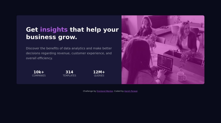
- To get the image to the required color, use that color as background color on the card-header section. Then, use mix-blend-mode: multiply on the image. You may need to change the opacity a bit to get the exact match. However, it gets you really close to the design.
- Media queries is a huge topic regarding responsive sites and I'm also learning. However, you are most likely to use @media (max-width: ....px){ design...} or @media (min-width: ....px) { design...}. The max-width means the design inside will be applicable from 0 upto that width. On the other hand, the min-width means that the design inside will be applicable from that min-width upto anything above. So, as you can see, they are for desktop first and mobile first design respectively. Going mobile first approach can help you write fewer lines of code. There are a lot more to media queries. Just Google, YouTube, there are plenty of great resources out there. Just remember, never lose hope, never give up. All the best. Happy coding
0

Please log in to post a comment
Log in with GitHubJoin our Discord community
Join thousands of Frontend Mentor community members taking the challenges, sharing resources, helping each other, and chatting about all things front-end!
Join our Discord