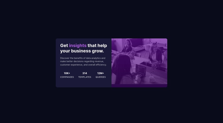
Design comparison
Solution retrospective
Feedbacks are welcome !!!
Community feedback
- @AdrianoEscarabotePosted about 2 years ago
Hi Hassia Issah, how are you? I really liked the result of your project, but I have some tips that I think you will enjoy:
You have used <br> , using <br> is not only bad practice, it is problematic for people who navigate with the aid of screen reading technology. Screen readers may announce the presence of the element. This can be a confusing and frustrating experience for the person using the screen reader. You can read more in MDN.
O unico heading neste desafio é esse:
<h1>Get <span> insights </span> that help your business grow.</h1>The rest should be elements
p.Every Html document must contain the main tag, so we can identify the main content, to fix this, wrap the main content with the main tag. HTML5 landmark elements are used to improve navigation experience on your site for users of assistive technology.
so wrap the container with
maintag.The rest is great!
I hope it helps... 👍
Marked as helpful1
Please log in to post a comment
Log in with GitHubJoin our Discord community
Join thousands of Frontend Mentor community members taking the challenges, sharing resources, helping each other, and chatting about all things front-end!
Join our Discord
