Design comparison
Solution retrospective
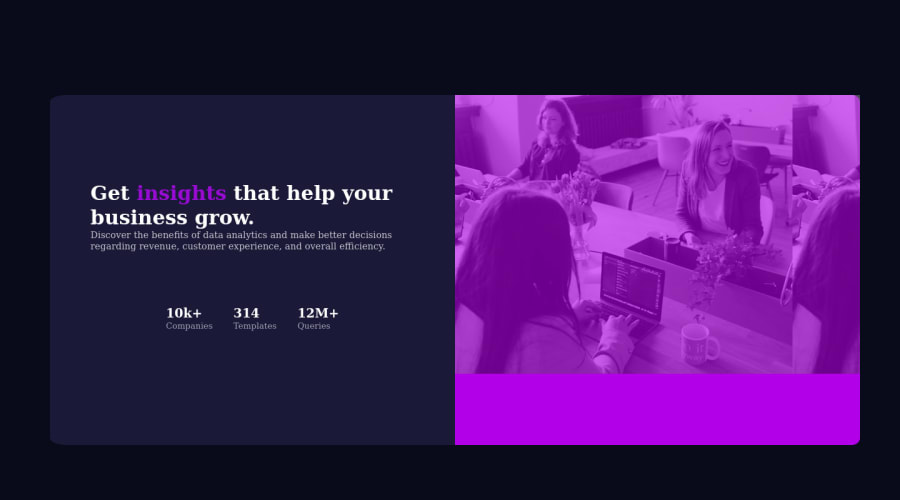
I made it for a tablet viewport😓. If you want to see it mobile, you can rotate your device to landscape🤦. Anyway, it might be disordered for both mobile and desktop🤦. Any suggestions to get these through are welcome. Thank uy 🤗
Community feedback
- @tesla-ambassadorPosted about 3 years ago
Hey, congrats on submitting your first solution! It's pretty awesome too! I just have a few issues to point out;
- Incase you want to get rid of a repetitive background like the way it is with the div containing your hero image, just set the "background-repeat" property in your css to "no-repeat".
- I noticed it wasn't responsive too just like you stated in your comments. But it's good coding practice to continuously resize your screen and apply media queries when items lose their alignment. It makes it super responsive.
- If you want to use some attributes more than once, consider using classes instead of ID's to avoid duplicate id's and this will eliminate your html issues.
Marked as helpful2@Shreyansh-07Posted about 3 years ago@tesla-ambassador Okay so now I have fixed it many issue's and added flexbox. But as you can see the latest screenshot generated by frontentmentor have a problem with height or padding of the card but that problem doesn't show up on my tablet when I preview it in desktop mode. I tried to find what's doing this but no results any solutions ?
0 - @Juveria-DalviPosted about 3 years ago
After rotating I can't see the text straight try using flexbox and I can't see your css file 🤔
1
Please log in to post a comment
Log in with GitHubJoin our Discord community
Join thousands of Frontend Mentor community members taking the challenges, sharing resources, helping each other, and chatting about all things front-end!
Join our Discord
