Design comparison
SolutionDesign
Solution retrospective
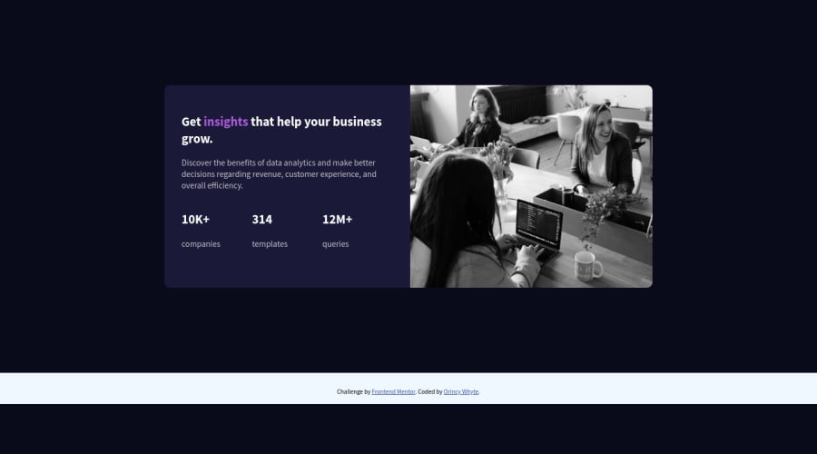
There is a lot more I could have done. I started this right as my JS course started, so I went back to it almost a month later 😬 and was just staring at my own code like I witnessed a m*rder. My biggest issue was the photo kept disappearing after I added the media query for small devices. I whipped up something so it’s hanging on by a string. All advice is more than welcome.
Community feedback
Please log in to post a comment
Log in with GitHubJoin our Discord community
Join thousands of Frontend Mentor community members taking the challenges, sharing resources, helping each other, and chatting about all things front-end!
Join our Discord
