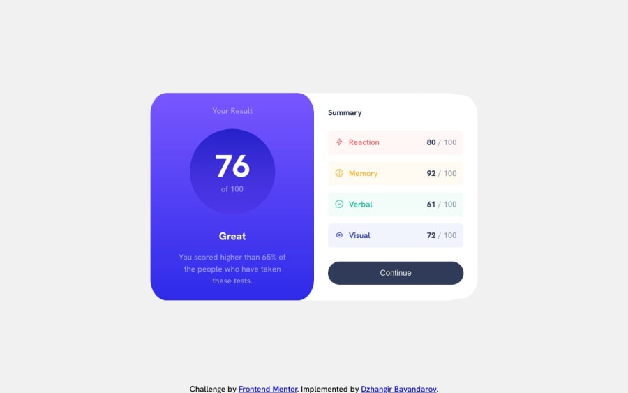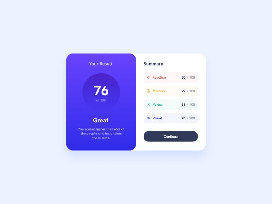
Static Responsive Results Summary component
Design comparison
Solution retrospective
In my styles.css I have used fixed widths (311px) for the two sections of the component. I was struggling to find a way to keep it the same width on a large screen size. I was wondering what's the best way to go about, since fixed widths are not responsive.
What are your thoughts on web components and in the context of how I used them?
Community feedback
- @grace-snowPosted almost 2 years ago
More important than anything else though - you need to change the html in this!
- You can only have one
mainper page. That's not just recommended, it's an essential accessibility requirement - The
headerelement has a role of "banner" and has a very specific purpose to contain repeating content across a site such as logo and navigation. There is no header in this design as it's a single component, not a full Web page. You are trying to use it here as a heading element. For that you must use a heading element. - Similar, you are using footer incorrectly here. There is nothing in the design that would be appropriate footer content. The content in the first half is just paragraphs and in the second part of the component should only be a button. Note for future challenges, you can have multiple footers or navigations on a single page but this is unusual, and if you did that, you'd have to label both of them in order to meet accessibility requirements
- I'm a little confused reading the html of the results list... I don't think it's wrong, that's not what I'm saying... It just feels overly complicated as I'm reading it, maybe because of the div in there. List items are already meaningful elements, so you don't need any paragraphs inside... If only expect to see the text parts inside wrapped in spans. OR the title of each result like "memory" could be a heading then the results number a paragraph I think. OR you could use a description list instead for all of this content as that element is specifically designed for key-value pairs like this.
General recommendations:
- it's better for performance usually to include the reset at the top of your css rather than.load a separate asset
- it's usually better for performance to load the fonts in the html head instead of within the CSS @imports
- height 100vh should be min-height as already suggested
- never ever write font size in pixels! here is my blog about why
- always define media queries in rem or em, never pixels
- next time work mobile first
- it looks like you've already used the max width approach on the component so maybe I misunderstood your question in my previous answer, I'm not sure. Making the max width into rem would still improve it though
Marked as helpful1 - You can only have one
- @SchismondPosted almost 2 years ago
hello DZHANGIR BAYANDAROV 1ST issue height: 100vh;
1.Fixed Height: Using 100vh as the height value results in a fixed height for the element, which means it will always occupy the full height of the viewport regardless of its content. This can be problematic if the content exceeds the viewport height, as it may cause overflow and lead to a suboptimal user experience, such as requiring scrolling to access the content.
2.Responsiveness: While setting the height to 100vh can create a full-screen effect, it may not be responsive across different devices and screen sizes. On smaller screens, such as mobile devices, the fixed height can cause the content to be cramped or cut off, making it difficult for users to interact with the website or application.
3.Content Overflow: If the content within the element requires more space than the viewport height, 100vh may lead to content overflow, where the content gets hidden or inaccessible. This can be especially problematic for elements that have dynamic or variable-height content, such as modals, dropdowns, or text containers.
4.Nested Elements: If the element with height: 100vh; is a container for other elements, it can restrict the height of its child elements, potentially causing them to overflow or be clipped. It's important to ensure that the child elements have appropriate height settings or use other layout techniques to handle their content.
2ND issue :
<main class="flex-row | max-width neutral-background flex-growth border-round">In semantic HTML, it is generally recommended to use the <main>, <footer>, and <header> elements only once per page. These elements have specific semantic meanings and are intended to provide structure and clarity to the content of a webpage.
1.Class Naming: The class name "flex-row" seems descriptive enough, indicating that it likely applies some flexbox properties to create a horizontal row layout. However, the pipe symbol ("|") within the class name seems unnecessary and could lead to confusion or conflicts. It's generally recommended to use alphanumeric characters, hyphens, or underscores in class names for better readability and compatibility.
2.Inconsistent Naming: The class name "max-width" suggests that it sets a maximum width for the element, which can be useful in certain situations. However, the subsequent "neutral-background" and "flex-growth" class names do not follow a consistent naming convention, making the purpose and intended styles of these classes unclear. It's best to use consistent naming conventions throughout your codebase for clarity and maintainability.
3.Border-round Style: The "border-round" class name implies that it applies rounded borders to the element. However, this class alone does not provide any specific border properties or values. It's advisable to define the border properties explicitly within the class or provide additional classes to control the border style.
3RD issue : Usage of :has Selector: The CSS code includes several selectors using the :has pseudo-class (e.g., li:has(.reaction)). The :has selector is not widely supported in all browsers. It's recommended to check the browser compatibility and consider alternative approaches, such as assigning additional classes to the relevant elements, to achieve the desired styling.
4TH issue : using a lot of classes html tag with two classes is more than enough , in your code you gave each tag at least 4 classes , and in your css you selected each class and gave it only one line of styling , this makes your code so long (which is bad for website performance) and makes your code unreadable
remember you the best code is the one you don't write , try to keep it simple
Marked as helpful0 - @ChrisCablishPosted almost 2 years ago
I think the fact that the solution you provided includes breakpoints where the design changes after the screen reaches a certain width (from mobile to desktop) means that technically your design is responsive. If you wanted the width to change along with the width of the screen you could look into using width as a percentage. For instance, if you wanted your component to take up 80% of the width of the body of your desktop design at all times you could set that element to width: 80%. That way the component will always take up 80% of its container (probably <body>) no matter if the screen is 1000px wide or 1440px wide or anywhere in between. Not sure if this is what you are asking exactly but figured i would give it a go.
Marked as helpful0@grace-snowPosted almost 2 years agoI disagree I'm afraid, the solution is not responsive using fixed widths and using percentages will remove a lot of control. As an accessibility focused dev I am aware how much people change their text size so these things become a much bigger issue when you think about them with that lens on.
The way to make this more responsive is to use max-width and use the rem unit instead of pixels. This allows the component(s) to grow up until a point but shrink a little if necessary. It also means the components will adjust along with the chosen text size so you don't end up with narrow.boxes constraining large text.
I hope that makes sense and is helpful. It's quite a hard concept to explain in writing to be honest
Marked as helpful0
Please log in to post a comment
Log in with GitHubJoin our Discord community
Join thousands of Frontend Mentor community members taking the challenges, sharing resources, helping each other, and chatting about all things front-end!
Join our Discord
