Submitted over 1 year agoA solution to the Recipe page challenge
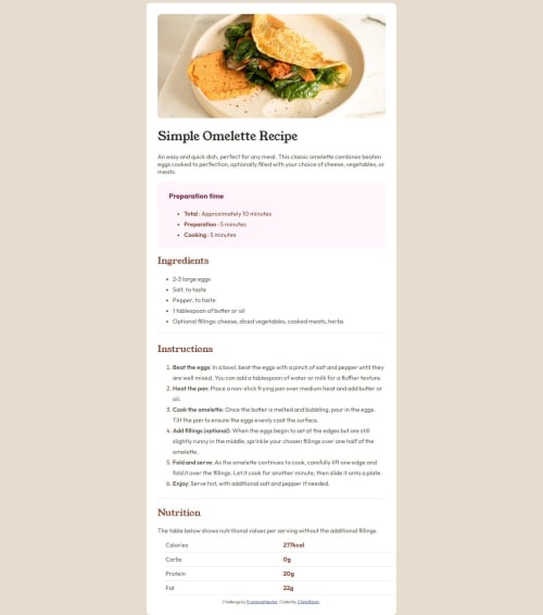
Static Recipe Page using HTML and CSS
@ChimiRinzin-HWR

Solution retrospective
What are you most proud of, and what would you do differently next time?
From a comment made on from my previous work, I learnt how to properly center HTML elements and also learnt to properly design a web page.
What challenges did you encounter, and how did you overcome them?Initially, it was really difficult to arrange the elements according to what I wanted but after patiently experimenting and tweaking with the CSS, I was able to easily arrange all the items according to my desires.
Code
Loading...
Please log in to post a comment
Log in with GitHubCommunity feedback
No feedback yet. Be the first to give feedback on Chimi Rinzin's solution.
Join our Discord community
Join thousands of Frontend Mentor community members taking the challenges, sharing resources, helping each other, and chatting about all things front-end!
Join our Discord