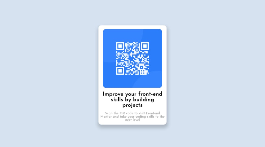
Design comparison
Solution retrospective
Still new to the whole HTML CSS world and trying to improve little by little each day. Could I have written less code and gotten the same result?
Community feedback
- @HassiaiPosted almost 2 years ago
Replace <div id="center"> with the main tag and <p class="paragraph1"> with <h1> to fix the accessibility issues. click here for more on web-accessibility and semantic html
There is no need to give #card a height value. Give h1 and p the same font-size of 15px, the same margin-right, margin-left and marfgin-top values. Give p a margin-bottom value.
There is no need to give p and h1 font-weight values.Use relative units like rem or em as unit for the padding, margin, width values and preferably rem for the font-size values, instead of using px which is an absolute unit. For more on CSS units Click here
Hope am helpful.
Well done for completing this challenge. HAPPY CODING
Marked as helpful1@RonaldoKashariPosted almost 2 years ago@Hassiai Hello, thank you for your feedback I changed most of the things you told me and it really made a big difference and cleaner looking code. Thank you once again.
0 - @manjeshrv592Posted almost 2 years ago
You have achieved desired results with minimal amount of code. It looks good.
From design point you can reduce the drop shadow transparency. 0.05 to 0.1 would look good.
Now coming to css selectors for best practice use classes as much as possible avoid id's.
Use semantic elements. In your case <div> tag with id name center, replace it with <main> tag.
Marked as helpful1@RonaldoKashariPosted almost 2 years ago@manjeshrv53 Thank you for your kind words and your feedback. I changed the things that you told me about, I appreciate the help.
0
Please log in to post a comment
Log in with GitHubJoin our Discord community
Join thousands of Frontend Mentor community members taking the challenges, sharing resources, helping each other, and chatting about all things front-end!
Join our Discord
