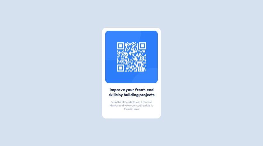
Design comparison
SolutionDesign
Solution retrospective
What are you most proud of, and what would you do differently next time?
I replicated the view pretty accurately for the desktop view.
What challenges did you encounter, and how did you overcome them?I found it hard to decide on when to use padding and when to use margin. I also found it difficult to decide whether to add an additional box for style purposes or not. For example, there are times that I could only figure out how to store my image in the center horizontally by adding a item around it.
What specific areas of your project would you like help with?positioning items horizontally, best practice regarding positioning
Community feedback
Please log in to post a comment
Log in with GitHubJoin our Discord community
Join thousands of Frontend Mentor community members taking the challenges, sharing resources, helping each other, and chatting about all things front-end!
Join our Discord
