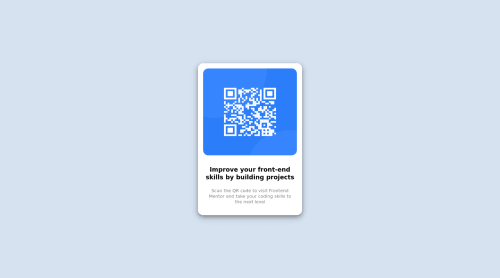
Static QR Code Scanner page with CSS
Design comparison
Solution retrospective
Really need feedback about my styling. Also suggest me about better way of centering an element to the page. Thank Ya
Community feedback
- @MelvinAguilarPosted almost 2 years ago
Hello π. Congratulation on successfully completing your first challenge π ! !
I have some recommendations regarding your code that I believe will be of great interest to you.
HTML π:
- The <br> tag is often used to create line breaks, but it doesn't convey any semantic meaning. When a screen-reader reads the text, it will break the flow of reading at the line break tag, which can be confusing for users. More information here.
Alt text π·:
-
The
alt
attribute should explain the purpose of the image. Uppon scanning the QR code, the user will be redirected to the frontendmentor.io website, so a betteralt
attribute would beQR code to frontendmentor.io
If you want to learn more about the
alt
attribute, you can read this article. π.
CSS π¨:
- Use
min-height: 100vh
instead ofheight: 100vh
. Theheight
property will not work if the content of the page grows beyond the height of the viewport.
-
Centering an element with
position: absolute
would make your element behave strangely on some screen sizes, "there's a chance the content will grow to overflow the parent". You can only use Flexbox or Grid to center your element.Here is an image of how it would look on a mobile device (taking into account the scroll): screenshot-imgur
example with grid layout:
body { background-color: hsl(212, 45%, 89%); font-size: 15px; font-family: sans-serif; /* height: 100vh; */ /* position: relative; */ text-align: center; /* NOTE: Using grid layout to center the card */ min-height: 100vh; display: grid; place-content: center; } .main-container { /* NOTE: It is not necessary to use flexbox here, its elements can be the same without all this. */ /* display: flex; */ /* flex-direction: column; */ /* justify-content: center; */ /* align-items: center; */ /* NOTE remove position absolute and use grid layout */ /* position: absolute; */ /* width: 300px; */ /* top: 50%; */ /* left: 50%; */ /* transform: translate(-50%,-50%); */ /* margin: auto; */ border-radius: 15px; background-color: hsl(0, 0%, 100%); box-shadow: 0 5px 10px 0 rgb(0 0 0 / 30%), 0 7px 21px 0 rgb(0 0 0 / 20%); }
You can read more about centering in CSS here π.
I hope you find it useful! π Above all, the solution you submitted is great!
Happy coding!
Marked as helpful2@muhammedsajadaliPosted almost 2 years ago@MelvinAguilar Thanks alot. You helped me with what I was looking for. Once again thanks!
0 - @HassiaiPosted almost 2 years ago
The body has a wrong background-color. Use the colors that were given in the styleguide.md found in the zip folder you downloaded.
Give h1 and p the same font-size of 15px which is 0.9375rem.
Use relative units like rem or em as unit for the padding, margin, width values and preferably rem for the font-size values, instead of using px which is an absolute unit. For more on CSS units Click here
Hope am helpful.
Well done for completing this challenge. HAPPY CODING
Marked as helpful1
Please log in to post a comment
Log in with GitHubJoin our Discord community
Join thousands of Frontend Mentor community members taking the challenges, sharing resources, helping each other, and chatting about all things front-end!
Join our Discord